


Posts posted by Shadow
-
-
Really nice work.
I'd rate the posing an 8/10. It's a pretty nice pose. It does have it's flaws, but they're mostly nitpicky stuff.
The lighting is a 5/10 for me. I do think you did a pretty job. My only tips would be to make the ambient color a bit darker. The lighting looks a bit on the bland side, but it's not exactly bad. I also suggest trying to use bleed light(or whatever it's called) to make things a bit more interesting. If you are using bleed light though, I think you made your light sources a bit too extreme. I would turn their radius down but it's all up to you.
This last tip is a little nitpick but I wouldn't suggest making the background fully black. Personally, it's not appealing plus it makes things sort of hard to see. Specifically the pants though. I'd just go for a lighter color.
Overall, I think you did very nice for someone who hasn't used the program in years. I hope you'll continue using it and I hope to see more of your stuff son. Keep up the great work. I can see you have a lot of potential. -
I might as well give my opinion on this even though the situation is incredibly stupid.
I do agree with some of the people who are mentioning that there are things off about the rig. I have a few opinions myself about how the rig looks, but that's not the important thing here anymore.
Everyone is entitled to their own opinion, but I don't agree with the people who are trying to force Sharp to take it and use it. People don't have to take your advice even if it may be true to some extent. Yes, people should take your advice into mind, but you can't force them to apply it to their work. Being aggressive about him not taking it isn't going to make him want to take it anymore than before. It's only going to make him want to take it less seriously. If someone won't take your criticism then move on and don't try to bother with them. That's what people should do instead of trying to force it on someone. While yes, I do understand that he posted it to the forum and should have expected someone to comment on it I don't believe people should have been so aggressive about the fact he wasn't taking it. You are wasting your time if you're trying to convince him to change something he doesn't want to change.
And to people suggesting that he should have stated he didn't want criticism, we all know that wouldn't work. I've been in the community long enough to know that people will believe that he is being sensitive or whiny if he states he didn't want anyone to comment advice on it. From my experiences, in and out of this community, people tend to ignore that and will still give you criticism. So, telling him that he should have mentioned that he didn't want people to give criticism on it is flawed.
I believe both sides are in the wrong here. Sharp should have been more open towards those who gave him genuine criticism without trying to force it down his throat. Though, I also think that the people who were trying to force him to take it and stating that he was egotistical and that he believes he's a god were in the wrong as well. You do not have to attack a person to get them to accept your opinions or advice on their creations. Be civil about it.
TDLR: Both sides were in the wrong. Sharp should have been more open when it came to the people giving constructive criticism but some of you guys shouldn't have been as aggressive as you were. Don't waste your time giving criticism to people who don't want it. -
teach me your lighting ways or get your foot eaten
-
-
3 minutes ago, Dr. Nexil said:
I think Ezra's posing is good, but the dragon feels stiff. Maybe you could try turning the dragon to the side a bit and move the neck so the head would still face Ezra.
Still a really good wallpaper, nice job!
Thanks.
-
It's been a while since I've posted and I just finished this render so... I guess this is what I am posting now.
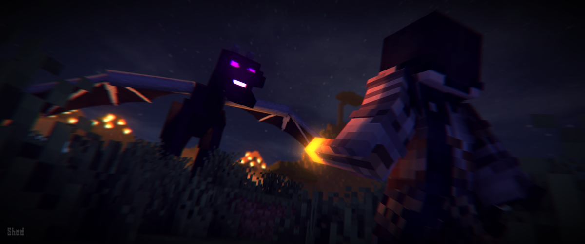
The story:
After three guards named Alistair, Dera, and Ezra find a boy. They try their best to ride into the closest and safest village. Their mission is to try to keep this boy safe and sound and away from the dragon that is on their tail. The dragon has successfully thrown Ezra off his horse, causing him to be unable to catch up with his friends. The best thing that Ezra sees that he can do is try to fight the dragon off enough to run off and find his friends.
Criticism is 100% appreciated.
Though I do know Ezra's pose is quite stiff.- Ghatos, Dr. Nexil, IraelianEnergy and 2 others
-
 5
5
-
20 hours ago, Glitch Block Studios said:
It’s really good, but if you really want criticism...
the guy guy in front of the lava looks like they’re running on air.
That was purposely done. It's kinda almost like that dramatic jump type thing. Thanks for the tip anyway.
-
-
3 hours ago, MasterArcher12 said:
I disagree
And the posing for the running is weird.
Normally, an arm and the leg on the same side faces opposite directions
Thank you for the tip. I just realized I messed that up. Sorry about that.
-
-
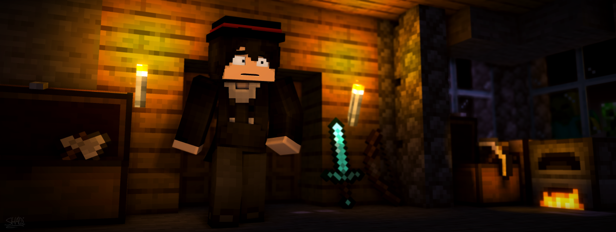
11 hours ago, CanadianLunaPogi said:
Background is pretty bland. Add some small details. Like depth blocks or something like that. Also isn't that he is suppose to sweat. Because he is wearing warm clothes.
I personally don't like adding little details like him sweating or something, but I will work on the background the next time around. Thanks for the tips.
15 hours ago, Awesome Emerald said:Noice
Camera angle is good, and it is very dark, but that's very understandable because it's the nether.
Although I will have to say that the character's balancing is a bit off, it's less convincing that he's running. Also, this posing looks incredibly similar to your "Monsters" wallpaper, it just seem the most original, but that may just be me, because I follow your posts. Also, I can't forget to mention, lighting is very good.
Keep going, 1+!
Thanks. I'm sorry that the posing did look similar. It was actually unintentional and I will try to fix it the next time around. Details and such seem to really be my issue other than lighting which is quite disappointing since that's basically kinda what matters most. Thanks for the tips.
-
-
6 hours ago, MojangYang said:
You did so well overall but just messed up one tiny “important” bit
Sadly. Maybe I should have been more aware when I made it.
-
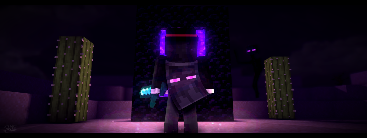
17 hours ago, CanadianLunaPogi said:
If you look close at the cacti it looks like it's floating.
I'm aware. That was a mistake on my part.
17 hours ago, __Mine__ said:This is just... wow.
I'm glad you like it? Lol
-
4 minutes ago, Eliphaz said:
Is that cacti... floating?
Maybe
-
-
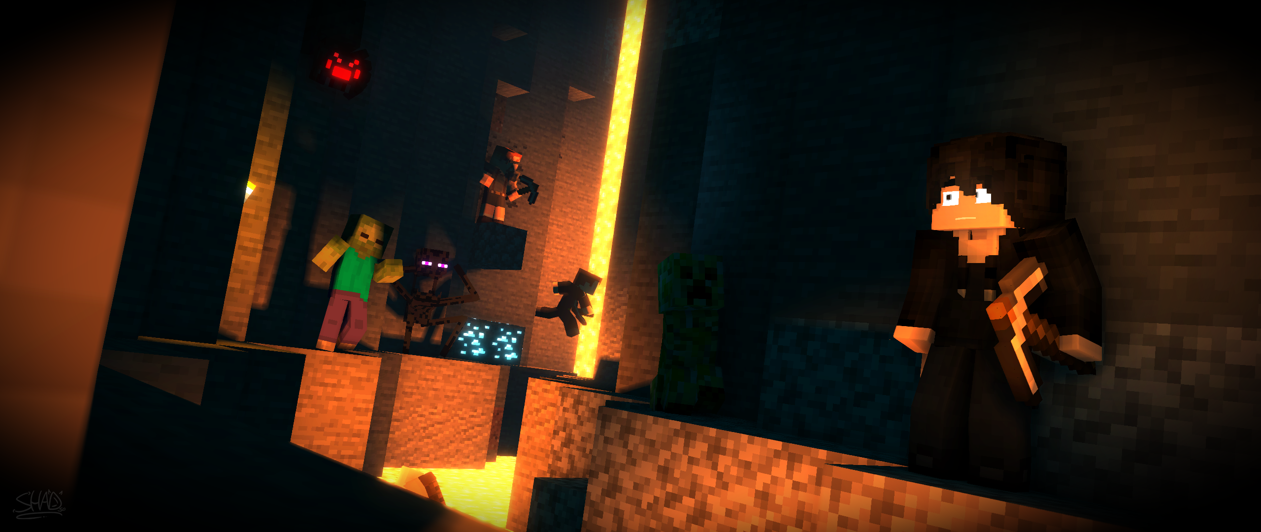
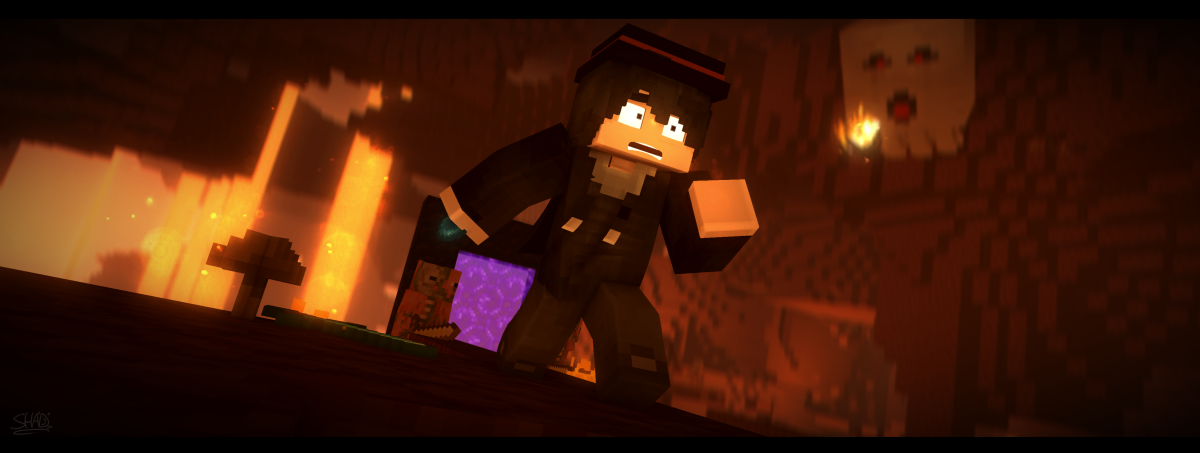
18 hours ago, Supreme Whovian said:
Why he scared?
If you look closely, there's a creeper and zombie in the window. The creeper is seen better though.
-
3 minutes ago, Awesome Emerald said:
I love that lighting, bro, and your rigs are good.
The only thing I can see is that the furnace fire isn't really lighting anything up.
But good 1+!
Thank you! I'll make sure to be aware of that next time!
-
I'm back. Yay. Anyway, I have a wallpaper here. All criticism is appreciated.
-
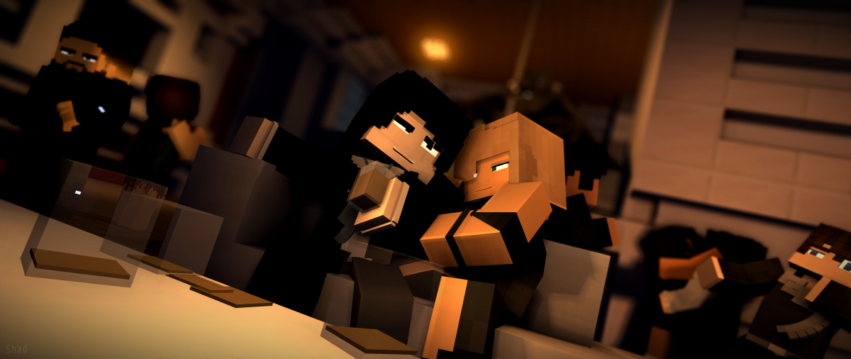
1 hour ago, Cubic Ralsei said:
Ah yes my favorite anime, Minecraft Battle Royale in a small map.
?
41 minutes ago, Gfamleit said:Alkaide forced him to drink--
-
21 minutes ago, Dignity said:
why are SKIBBZ so grumpy
Because he's a grump grump.
-
Hello, everyone. I am back with another wallpaper.
I decided to make this after someone suggested an idea for a wallpaper. This render somewhat has some story to it, but it's something I'd rather not get into.
The wallpaper itself is decent. It still has its flaws as expected.
Anyway, I hope you all enjoy.
-
3 hours ago, IraelianEnergy said:
Age and maturity are two completely different things.
Exactly. I mean, I'm 15 and have the maturity of a 9-year-old.
-
1 hour ago, jakubg1 said:
I see no difference between an edited and an unedited one.
Well, I mentioned what those differences were. I added the signature and some of the vignette. The edited version is a bit darker than the unedited one. Either way, the differences aren't that important... Just the overall outcome
")
-
Recently Browsing 0 members
No registered users viewing this page.
the birthday of some dude with a good cut g (4k cinematic)
in Wallpapers and art
Posted
I'm very late, but happy birthday.