


Everything posted by 9redwoods
-
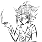
This man's eyebrows are longer than a villager's
-
500 REP! WOO!
-
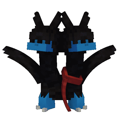
Ok, ok, ok. I know png/surface wallpapers are lazy and all, but I found this awesome image on Google images and had to replicate it. After lots of struggle with alpha glitch and shadows, I finally got it to look half-decent. It's not my best, but it works. If Nimi or David looks at this, I want to tell you guys about the stupid glitches that are still here. You can see by the trees, there are random smudges. Also, around some of the surfaces, there are random white pixels that aren't in the PNG. It's not the alpha glitch either, I'm smart enough to turn the render depth up. Anyways, here you go. This is one of the first images that I didn't edit in Paint.NET or anything. ok bye
-
The posing needs tons of work. The lens flare is way too strong.
-
Incredible scenery! Totally incredible! I think the posing could use some work.
- 4 replies
-
- 1
-

-
- wallpaper
- environment art
- (and 7 more)
-
Hey guys! So I had this idea to make a topic about this. Here are just a few things I would change or add in the 1.2.0 update. Just to let you know, this is just me laying out my thoughts, so if you think I don't like this new update, you're 100% wrong. Let's get on with it! -------------------------------------------------------------------------------------------------------------------------------------------------------------------------------------------------------------- The "..." are a bit confusing and don't really make sense. Maybe add a drop-down arrow or something instead. Not everyone will like the ease out on the work camera. What if there's a setting in "interface" to turn it off? The new checkboxes under Active Camera in the frame tab have a weird thing to them. When you check one of the boxes, the boxes underneath uncollapse. It makes it kind of awkward to try to collapse the checkboxes again every time you try to check a box. I love how you can change the color of the scenery foilage and everything, but why not go one step further and give them Add and Subtract color properties, so you can change the brightness of the foliage and everything? The custom watermarks were an amazing idea. It's awesome that you can change the position. But wouldn't it be better if you could just click and drag the watermark? It would add even more customization. And maybe you could make it so the watermark only appears in animations and not images! There are a lot of possibilities. I love the new updated resolutions, but it can kind of be confusing with all the abbreviations and seemingly random letters. Maybe if you hovered your mouse over a resolution, it'd tell you the abbreviation or something. I think that would be a nice addition. -------------------------------------------------------------------------------------------------------------------------------------------------------------------------------------------------------------------------------------------------------------- Again, this is just me laying out my thoughts. Overall, this update is the best update in a long time, everyone did an extraordinary job. MI has done so well and it's amazing to see how far it's come. I'll see you all later!
-
Now all we need is reflections!!
-
Ok. 1. It wasn't a schematic 2. I tried. The fog didn't work out the way I wanted it to, so I took it out. Thanks for the criticism.
-
I don't know what that is.
-
ok.
-
It’s sad because I want there to be more topics and wallpapers and everything, but if that happened, that would mean more people, and that would ruin the amazing personality this place has.
-
The rain looks very fake.
-
Sorry, I don't know who that is.
-
You need to move the body and head more
-
Np. It really is the best show in history.
-
One reason I didn’t want to add more scenery is because in the show, it’s just snow and trees. Thanks for the criticism
-
The lighting looks kinda off. I can’t tell what though.
-
Well, if you watch stranger things, you’ll know ?
-

voice acting Protect and Serve (Looking for a few voice actors)
9redwoods replied to Mineshaft Animation's topic in Team requests
You need to give more information on how you want the voice actor to sound. -
Don't drink and animate, it may lead to severe linear transitions and other side effects.
-
modelbench Suggestion: Multiple Bending Points On One Part
9redwoods replied to Hectoris919's topic in Modelbench discussion
You can give the effect of that. I have wrists on my character rig. -
modelbench Suggestion: Multiple Bending Points On One Part
9redwoods replied to Hectoris919's topic in Modelbench discussion
You can do everything he said in modelbench

-
Recently Browsing 0 members
No registered users viewing this page.