
Everything posted by PigmanMovie
-
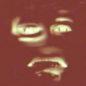
I have make sure that i set my phone brightness to an absolutle max so that i can make sure that the wallpaper is actually not dark but this... Criticism: -even if you are at a cave or a place where you can't even see anything,always make sure that the viewer want to focus at (like the human and the nether portal) can see the object that they are suppose to focus at -bright color and light is a good way of creating composition Example: put something on the left so that is pointing to the main object like spider looking at the portal or something (ik it's hard to do,but try to make the viewer feel more comfortable and interested on your wallpaper) -and big light coming out from the nether portal is a good way to brighten the image while still feel like you are in a cave,just make sure don't overdone the portal light -angle is a bit meh for my taste,maybe try to put the camera between steve and alex,put the camera at the legs and make the camera look up with a bit of FOV,it can make the nether feel like a much bigger place to explore (i guess idk) It is an ok wallpaper but because the image is soo dark,i can't say for sure
-
You done a good job Criticism: -i feel like if you are adding cel shading,it should be applied to all object because if you add it to just a specific object,it just make the render feel odd -for some reason the fog feel a bit sharp for me,idk if it just my eyes or it's the wallpaper itself -nice angle,could be better tho ? -this probably just me but are they looking at the obsidian or the lava? Im confused Other than that,this look good
-
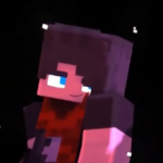
-find a high resolution image -the character and the image behind him doesn't feel like part of the world Match the lighting as the same as the image to make it feel like he is part of the world,or you can just made a minecraft version of that background -the posing feel stiff,i recommend find a pose refences online so that you can make a better pose and remember weight when posing,every creature and being have somekind of weight when moving or something (unless they are in a planet that doesn't have any gravity) Other than that,just keep practicing and hope that you will be good at it one day ?
-

Moving on (Non-Minecraft wallpaper)
PigmanMovie replied to Cryptic Runner's topic in Wallpapers and art
What are you suppose to tell through that render? What story are you trying to tell through that render? Is it just a test render or a render that has a story behind it? Cuz im curious -
Codename Survival Episode 5 - Teaser
PigmanMovie replied to Cryptic Runner's topic in Narrative animations
I would say spend more time on your teaser so that you can hook more people and judgemental people (like me lol) to watch your series -
Codename Survival Episode 5 - Teaser
PigmanMovie replied to Cryptic Runner's topic in Narrative animations
This feel like a 2D animation except it's only just a part of still,nothing move for like a minute,usually i focus on camera movement,angle,and other stuff if the teaser is just a part of still -The teaser is boring and confusing,it's really hard to read -the glow blur is just too much -the lighting feel's a bit non-sensical (does that word exist?) in some scene Example: at 0:34 there was a glow at the back of the guy who is about to get murdered while the torch is actually infront of him -The music,the lighting and the direction (ik it's a bit professional but im including it anyway) doesn't really fit the teaser,The direction is kind of bad,i can forgive the story if it well told -the teaser lack an animation,3D suppose to have a lot of movement because it's a 3D object,we usually move even if we just idling,2D sometime can survive this but 3D can't -the teaser doesn't give me any convincement (it's not a word but idc) to get hook at the story -honestly,the world feel's a bit empty I don't hate it,i just think that this teaser was oretty rush due to lack of movement and bassicly a boring scene that is extended to bassicly make the video duration a bit longer I have no expectation for the full episode,but i really hope that the episode is greater then the teaser -
Another Star Wars wallpaper [Wallpaper - 4K]
PigmanMovie replied to Adri526's topic in Wallpapers and art
Pros: +those lightsaber effect look really damn great,the glow blur and everything about the glow is perfect Criticism: -i feel like the angle and the pose could be a bit better Option 1: Option 2: Option 3: -lighting could be a bit better -the pose look very stiff,i would suggest looking at refences online or even use some star wars pose for refences -i feel like the color doesn't really match,try to remove 2 lightsaber and then choose a combination of:blue and red,red and green and blue and yellow (just my prefences) Not bad,could be better,but i really like that glow,it really match my prefences of MI glow -
Since my laptop is still broken
I will go around through the forum to critize some quality/masterpiece/ehhh/not bad/good/meh/what the heck is this? Stuff
-
Moving on (Non-Minecraft wallpaper)
PigmanMovie replied to Cryptic Runner's topic in Wallpapers and art
-the lighting and the compositition make the scene a bit confusing and hard to see/read -seriously,i can't even see the character -that glow blur on the side is...a bit too much for my taste -the atmosphere doesn't really tell the theme perfectly,is it a sad theme or a murder just happen or he can't move on because of his ex idk -is he holding a knife or a box,because i swear i seen him holding a knife but then it changes to a box,make the scene a bit brighter and maybe have somekind of light/lightrays reflecting onto the figure so that the viewer can see what he is doing and what's he look like -(my prefences) i feel like the scenery is a bit empty a flat That's all,i would say this an ehhh...idk There's just nothing special to look at -
I would say that the atmosphere didn't really fit my taste of the halloween theme -The scene is a bit confusing to read -the lighting could be a bit darker in the room to make it a bit scary and unpredictable (idk why i use that word) -the villain i guess is suppose to be the main villain but it's blocked by that heavy light rays making the villain hard to see,i would suggest add somekind of glowing eyes to make sure the viewer notice it -(this is just prefences do not take this part seriously) i feel like the scenery is a bit small -pose is a bit stiff,i would say make the villain have a scary neutral standing pose and the one who get stab have the same pose except put the knife infront of the body so that the viewer can understand that he has been stab brutally (i guess,just my prefences tho) Other than that,it not great but it's not bad either
-
I know flatland are a bit boring sometime but there is something with the atmosphere that make boring scene into something that's pop (for me) I really the color that you choose,those bright and vibrant color fit the natural,peaceful and happy theme i guess? One upvote from meh!!
-
Not gonna lie,the texture is actually really well done The only thing im a bit dislike is the bagel is square and not square but style has a round shape But that's just my prefence,good job (since my laptop is broken right now,i will go around at the forum and discord looking at thing)
-
Today is meh birthday

and my laptop is broken...
goddammit
-
Didn't know that you are talking about the glow Yeah,balancing glow with bloom to make the scene brighter but also not putting too much glow is difficult But thanks
-
I for once,tried to break my laptop limit (2GB ram potato laptop) to see how it handle with a scene like that,since i always use simple scene setup. Went i half way doing this wallpaper i was like "hmmm,how about i make the viewer that see this wallpaper struggle to try to find what they need ti focus at,yeah..that would be a great idea and people will hate it :D" other than that,yeah...the decoration is too much i try better next time Eh,kind of Thanks
-
Hello! long time no see i have overshot thedecoration a bit lol bye
-
hey,my name is PigmanMovie!
im a statue
i can't do anything
mainly because school suckThat is my Quality Poem
not really lol -
hohohohoho nice!
-
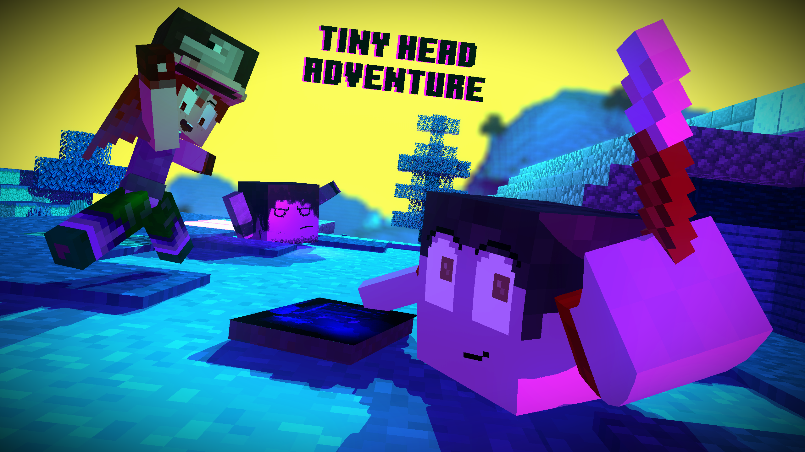
hello so im back (kinda) and i made this wallpaper this wallpaper is just me practicing my compositing skill bye
-
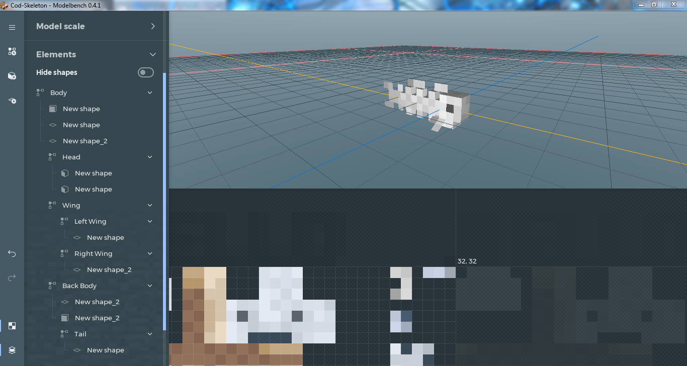
so...
i haven't really continued the fish pack model since last week
because of stupid drama with madboxbut im back (welp,not really,cuz school)
i ran out of ideas on what fish i should made
so,if you want,give me suggestion (or idea)the theme that i am aiming for the fish pack model is deep ocean fish
your suggestion doesn't have to be deep ocean,cuz there is still a lot of normal ocean fish that i haven't made yet -
hello so..it an independence day for my country (indonesian) originally i was planning an animation for independence day like a year ago but then i forgot to animate it,so i force myself to just create this wallpaper didn't really take time to plan this this took like 30 minute to make yeah,im soo rushed bye.. that it..bye
- 3 replies
-
- 10
-

-
people downvoting this because they didn't know the used for this advanced model this is really helpful for people who want to make an advanced movement with folder but just too lazy to set it up i already have one,but i try this one later
-
(ANIMATION) I'm still recreating dead memes
PigmanMovie replied to Bugleberry's topic in Random/Test animations
Ayy it my good'ol office chair -
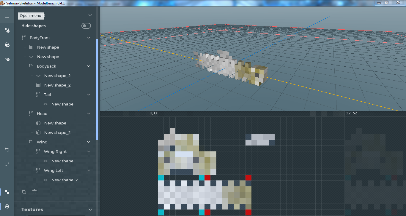
Let Search some dead fish underwater
i regret making that qoute
-
E N D L E S S T R I P E N D L E S S P O S S I B L I T I E S E N D L E S S A N Y T H I N G ! im not even going to join the argument xP


-
Recently Browsing 0 members
No registered users viewing this page.