


About Jake_28
-
Rank
i cant chill dude i just cant, i even tried eating blue ice
")
- Birthday 08/31/1906
Recent Profile Visitors

Malovec.thumb.png.f76e5547a433ec260415136555e71638.png)

Single Status Update
-
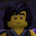
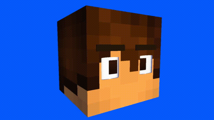
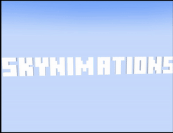
I made some logos, any feedback?


And heres a logo i Edited

-
- Ninja Dino and MikTRF
-
 2
2
- Show previous comments 1 more
-

Ok so I have some criticism on the logos.
1. The "Jake edition" text's dimensions are off. The top of the text (the darker part) should be the same angle as the "Minecraft" text. It should slant like this:
Spoiler
Obviously you would have to fix all the other 3D parts to the top, because the N looks weird, but it was only an example. I believe you can do it.
2. The "Jake edition" text doesn't have anti-aliasing, so the pixels are very sharp. Just fix it by using the "feather" tool.
There we go
Spoiler
-
what is his feather tool you speak of?
also, thanks for the constructive criticism, I’ll try and fix these rn
edit: wait you provide a “fixed” version I don’t have to do anything

-
-
Recently Browsing 0 members
No registered users viewing this page.