
Posts posted by Ninjabee_Redtricity
-
-
.....
That's cool...
-
-
I'm sorry
But the video could've been good. if there was some kind of throw-away joke with the villagers and the coffin. like...maybe a skeleton pops out, and the Wolf girls automatically turned hostile...or something...IDK.
Either way...I take my like away..I'm sorry, but it wasn't deserved ...
-
I'm so happy to live in a time-line where this can exist...
-
-
Well....That was something..
-
In seconds 0:06.
At that moment when he brings out the sword to unsplash the creeper; I think there should be at least a small moment of time to anticipate before he performs the upper slash move.
Just a small improvement L:
-
Not a big M.I fan, so I'm not REALLY a follower, but it looks pretty decent lighting wise.
-
Pfff...No energy...
Appreciate the smoothness though.
-
Separate the skin to two parts, the part that glows and the part that don't.
Maybe add in a few small source lights around the sides to give the illusion the lights are actually glowing.
At least that's the best you can do L:
-
6 minutes ago, Chirp said:
Ask him tbh [It's his edgy edge lord]
It's not the design, It's the plain straight pose..
-
In all seriousness
I think it's o.k.....but I really feel like their can be improvement.
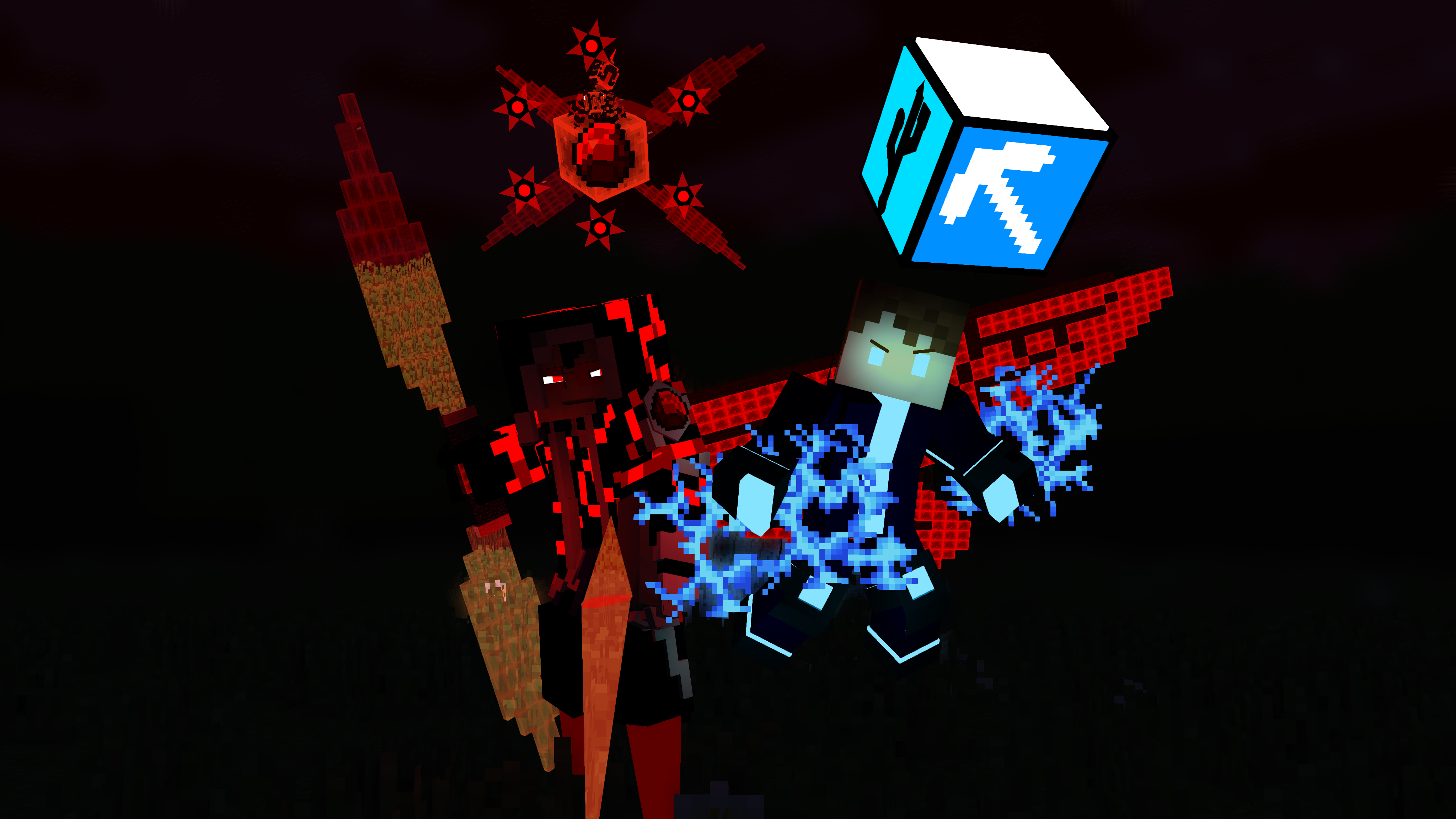
That winged character annoys me the most
-
Most of these Poses are actually pretty boring tbh...
The only thing most tell me " Oh hey I'm edgy and cool!", but that's it.
Now how could you improve them? Simple, just avoid them from looking too similar with the straight up standing.
Have some line of action to show show personality between them all.
If they have any...
-
-
I looked at your animation a bit in detail. Time to critique.
While I'm not sure what animation style you're going for, I still believe there is still room for improvement. I highly recommend you check out the 12 principles of animation to get started.
particles. Just a food for thought maybe. Another thing is Having some extra drawback to the jump. But one thing that I could suggest is possible squash and stretch. maybe some exaggeration, etc. But one detail I noticed is as soon as he was jumping in the air, his feet were not fully stretched out in the jump, so it looked like he just randomly bounced upward in the air. I would've also like to see his head and body in focus at the end of the jump. And did you also use different transitions aside from liner in the animation?
- Frost and CPS Animations
-
 2
2
-
I remember that one time your animations sucked.
You came pretty farther then me actually. Good skill and have fun improving ahead.
-
So bendy the ink machine is the new Fidget spinner FAD people are going to hate thing?
Also, the animation looks really incredible, So good I can't really say anything much, I just love how the character moves all parts of his own body to convey emotion.
-
Here are a couple of good tips for making a good pose
#1: No Symmetry. Symmetry can get pretty boring and doesn't really express or show a lot of character, while he is turned to the side a bit. There is still no symmetry with the body.
#2: If I were to outline the imagine and have it all black in the inside,(AKA look at negative space or create a silhouette) I couldn't really identify the character. While yeah sure it is a Minecraft human model. Making it see the arms and legs seem attached to the model just isn't appealing to look at very much.
I Guess the only expression of character I get is he may have a lack of confidence or has one. IDK it seems pretty boring and even without a mouth. It makes it more confusing to tell what kind of character he really is.
-
It would have been funnier if we actually saw the other person's reaction. But still pretty good though L:
-
While their was no main part of this wallpaper I should focus on instantly, I got to say.
you made everything else pop up equally. Like a true wallpaper. Nice work!
-
The last part with the wall cracking is pretty impressive, but everything else was a bit meh.
The First part which I guess is the introduction wasn't really too strong.
So we start off with Blue Stevfe standing up and appears to me that he must have been forced to teleport somewhere else in an environment where he has some disadvantage. We then present in an opponent grey Steve. I wasn't sure why he teleported in though.
Was he the one who teleported blue in the city?
Was their some meeting the two agreed on before the fight, but that wouldn't make sense because blue got off the ground as if he were knocked out or something.
From what I could tell this didn't make too much sense, Grey and Blue were not showing any sort of emotion, while yes. You don't need a mouth to express a emotions. You could have moved the eyebrows a bet up or down to convey a sense of anger in grey or fear in blue. All I saw was the same expressions, while their were slight movements of the pupils to get an idea of their focus. More noticeable movements of eyebrows could've made the animation a lot better.
I didn't exactly notice it at first, but the part when blue Steve was giving grey steve a weapon seemed a bit of an interesting idea. Giving us an idea how honorable blue Steve is when it comes down to a fight. And then when grey closes the offer. we could get an idea that maybe grey could be way too prideful in his abilities or that he would want to take his opponent down so badly, he would want to take it personally fist to fist. And when blue notices the fact that his offer is declined; he could be in major shock or fear as to he is getting an idea how powerful he is.
But due to no actual eyebrow movement, I got no idea what emotion the characters feel and due to their similar eye movement and skin. I didn't even notice this bit. Once Grey neglected the offer. We didn't even see how blue felt afterward, we just skip to grey showing off expelling energy. That part could have been removed and if the sword neglect had more attention. We could've gotten a better idea on how the odds are in this fight.(Plus Grey never emitted any energy attacks so that was pointless)
We then get a couple of shots of them starring at each-other in the same expression. Then we get another of blue Steve having white eyes...
Aside from my whole hate on the Herobrine creepy pasta. I'm just going to say that now. We get an idea that blue Steve is INSANELY powerful. This makes the viewer rooting for blue Steve pointless. I could disagree saying the whole sword thing was an indication to grey that he was telling him he needed a weapon because if he didn't he could die easily. I'm not sure of Herobrine is another mind(Like Ati) Or blue Steve just doesn't want to fight. But from that transition we don't know if he is doing it within his will or is something he can't control. The Herobrine flash could be a warning to grey. but grey shows no expression and attempts to punch blue steve.
This is where the fight sequence begins and I found this fight to be extremely dull.
For one I don't see a confused expression upon grey Steve once he realizes the teleportation due to the dark lighting. It may look better if Herobrine WAS shown black only and we could clearly see grey. A possible better option is have grey's eyes glow to show his confusion and the realization that Herobrine is behind him.
So when we get to grey, this possibly may be the dumbest kick I seen in a fight. For one Grey Didn't really have any build up to his kick. He just swung his leg at Herobrine as if he thought it would be an actual kick. He wouldn't even need to kick. Because after looking at the shot several times I noticed Herobrine teleport in range off-screen for no reason.
Now for scenes involving conversations. It's fine to teleport the character where it's needed. But in a fight scene. It's a huge no-no.
Back on the kick, Now this is where I find the most stupid. You got a guy who is pretty strong and relies on his hand to hand combat to take down opponents. Since he is fighting something so powerful, We should get an idea that he is not fooling around. But here is the part that breaks all the logic.
He just wings his leg and just turns his head around away from the opponent. Herobrine didn't even NEED to teleport to surprise him. This just doesn't make any real sense especially for a fight scene. Yet he...Turns around slowly? It's like he is ASKING to get punched in the back of the head!
And we finally get to the final and only good part. So Herobrine teleports anyway and he punches him in the back of the head. (Not sure if he is intending to kill or suffer his opponent painfully but I will let it slide)
I actually looked at some of the details on last few shots. we see a crack on the wall as well as a block falling to the side. Giving us the idea that the impact was powerful.
And that's pretty much the animation.
Sure their were a lot of negative things i noticed. I will say the movements do feeling very smooth and some shots are very well done. While a few shots overused in MC fights, Overall they were alright.
Now the only reason why I spent 20 minutes of my time typing this comment and nitpicking many things was mainly to help you improve. While I did quit working on M.I a while ago [And have really bad animations] I'm still willing to critic and support a few creations to help others like you. So please be glad I spent a considerable amount of time typing out as many flaws as possible. I could've easily just went to another page and type nothing, but I typed anyway because, well why not :/
EDIT: And the music in the beginning was well fit as well as the syncing, but then when the first punch happened, it had a happy tone and just really didn't fit, that's all I have to say music wise.
-
Question
Was there any inspiration from XCOM when making this creature?
-
-
1 hour ago, Crated said:
When @SKIBBZ joins a collab, something great is bound to come...
Actually, when SKIBBZ joins a collab, the video usually gains a 50% increase on Entrys
[its actually true, admit it]
-
Recently Browsing 0 members
No registered users viewing this page.
-Metallic MobSpawner
in Models
Posted
Bruh...This is actually pretty cool