

Posts posted by KrisFirebolt
-
-
4 hours ago, Jax Hallows said:
i legit love furries (call me weird if you wanna IDC) n i love this picture.
I think they're alright, some can make really cool things
-
1 minute ago, Jax Hallows said:
Thanks
 new one is ment to show gay pride support and all
You're welcome, and, why not? ^^
-
I like the glasses ^^
-
4 hours ago, Fray said:
The one who looks embarrassed? Cipher, the cat lol
No, the one next to it

-
This was awesome, its a bit corny but I like it
-
28 minutes ago, crustyjpeg said:
lol
59 minutes ago, Fray said:Honestly its one of my favorite card game. Thanks!
Who's the bat looking one?
-
Nice to see furry content, sort of.
Uno can be a fun game ^^ -
-
Aw, I love it!
-
7 minutes ago, wafflecakes said:
K
Thanks!
You wanted constructive criticism.
-
Thumbs up for very pointy boiys
I am not familiar with this dinosaur type, but it looks hard to tell where the body and neck ends, I'm not entirely convinced by the head. However, it looks pretty cool for a start, you can keep making more, just have fun and enjoy it. ^^
-
-
Any other day I'd just say this looks like a confusing amalgamation of resources, but that wouldn't really help. So I'll put some time into a comment.
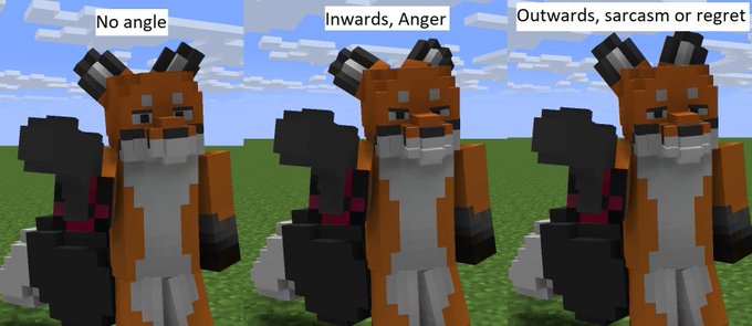
The eyes look a bit derpy and unusual, like the character drank something that made them woozy. It might help to try out rotating some eyelids to convey more emotion.
Instead of leaving it flat, you can angle one or both of them slightly. Variations of eyelid angles can make many expressions on its own, unless you meant for it to look half asleep.
Here's an example I have made for this reply:Spoiler
Now if you've meant for the character to be threatening, or not, its really up to you. However, if the light is directly facing them, the pupils would normally shrink to prevent absorbing too might light. If this is what the eyes look when shrunk, then your normal sized pupils are far too big.
I find the mix of styles to be awkward. The background has varying amounts of texturing and pixel usage, your skin appears minimalist yet there's definitions of skin shading. That's perfectly fine and all so far, though what trips me the most is that the head has a completely different style that has nothing similar to the skin texture, or even the background. I will argue that there is a way to make entirely-flat-colors and varying pixels work together instead of separately, I would recommend experimenting and trying out something that works, it is possible. See my example.
I think the phantom wings look cool though, it might help to angle them downwards or any other angle that isn't completely parallel or sticking out, give it some weight. I'm not sure what's the texture going over the chin, a folded-down scarf? A mask?- 9redwoods and TheJeweledWolf
-
 2
2
-
37 minutes ago, Darksupercool said:
AAAAAAAAAAAAAAH! I forgot the Side Mirrors in the FD, jaja.
I swear, I really thought that I put them, jaja.
That's alright, things happen. I forget things as well.
-
Ah, good to see the second car has side mirrors
-
-
Do they have a tail?
-
aww!! cute!
-
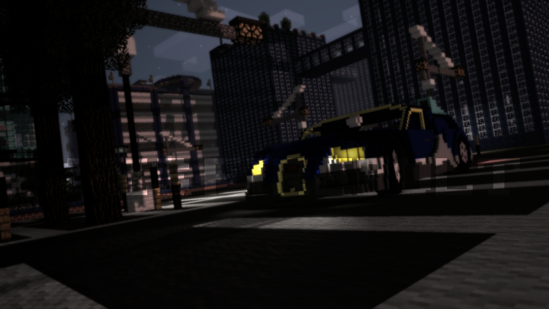
I think its kinda fun for a wallpaper, the stretching blocks makes it fun and cartoony, the motion blur gives it that strike of action. Really like that custom sword, its neat. ^^
-
-
I'm just happy to see side mirrors. ^^
-
HONK HONK AM GOOSE
-
6 hours ago, Mafa Animations said:
I don't know what that is and I'm not going to click on it. No context either.
-
Imagine playing the game like this
-
Recently Browsing 0 members
No registered users viewing this page.
Across the lake (STORY INCLUDED)
in Wallpapers and art
Posted
woah i remember watching someone play Fallout 4 with those siren heads