
Everything posted by Cryptic Runner
-
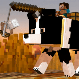
Boney Man the Hero 2: Boney Man VS Charged Cow!
Cryptic Runner replied to Boneymation's topic in Narrative animations
i actually love this. despite the rookie level of animation, it's still extremely entertaining. -
gtao2 fanmade logo

-
- Draco63 and LacaMenDRY
-
 2
2
-
made this fanmade gta 6 logo.

i've made more logos than anything else i've ever made
-
- Draco63, MojangYang, FOXY TOONS and 2 others
-
5
-
POV: you're animating a walk/run cycle
-
i watched totoro and spirited away
am i a weeb
-
it's the thing that happens when something is inside of something else in 3D rendering, the thing that makes 2 textures kinda try to appear on top of each other. it happens in some games too when you're far away from stuff, for example, graffiti on a wall. it looks like this:
-
i like watching parkour videos while knowing very well that no human is actually capable of doing what they're doing
-
which one? british?
-
this message will be self destruct in 5 seconds after you finish reading it
-
the more i play watch dogs 2 the more it makes gta v's world look pathetic in comparison
- Show previous comments 3 more
-

-
-

I just played GTAV Several times ago,Then I realize that After I done the missions,Then what? And yeah there are so much interactive properties,npc,events,etc.
That makes GTA5 A lot better,and Alive unlike The Others game. But I've been never played Watch Dogs 2,I already Played it on my laptops,and guess what? Yeah Exacly! the Limited hardware that causes me can't play the game.
But GTAV is still a better open world game in my personal Opinions.
-
there's already an automatic walk and run cycle button. there's also keyframes to download if you don't like the program's builtin cycles.
-

saw this on a post, is it a new logo or just an export icon?. if it's a new logo, it really wouldn't fit as a logo at all. it doesn't say "minecraft animation software". there's a similar issue with modelbench's logo, it doesn't even show anything related to modeling or minecraft. they're also just not appealing at all.
-
- 9redwoods, DragonPixel, __Mine__ and 3 others
-
6
- Show previous comments 4 more
-

I appreciate the feedback but it's a non-issue, a few downvotes doesn't mean I need to change the icon.

If this really was a decisive issue and a lot of people were very vocal about it, things would be different but as far as I'm concerned, it's only a handful of people at most, with an aversion to change.
I've already stated my reasoning so there's nothing else for me to say. As I've said in another status, you can always change it yourself or just give it some time and get used to it.
")
-
the reason why I downvoted its because I simply don't like that design. statistically speaking, what is the number of people that likes the new icon compared to the old one? if there is more dislikes, the answer seems simple, don't change it. but I understand your reasoning, a simpler icon would certainly be easier to see, but if people are going to dislike the design, no matter how easy it is to see it is not an improvement. do you agree?
-
A friend of mine said this on discord:
QuotePersonally, I think it would fit really well...
...If Mine-Imator was a generic 3D animation program.
Which it isn't; it's a Minecraft themed 3D animation program.Also, personally, i think the top in each of these columns is the best icon for each software:
Spoiler
They're tied to minecraft while showing what they are.
A world importer, a section of a world,
a crafting table with props and stuff in it,
a crafting table (ties it to MI) being broken into chunks (since you can use modelbench to make models like that).
-
everybody's tripping on re8's demo while i'm thinking about this when i look at it

-
sites like dafont allow you to download them. as for using the fonts, you simply have to select a font for the text itself.
-
sunset Sunset Coffee [5000x1440]
Cryptic Runner replied to TheCollieStalks's topic in Wallpapers and art
i love how the painting in the background is slightly bumpy -
-
situational tip: bloom with no radius & high threshold can give a super cool cel shaded specular-like look to highlighted things in mine imator
-
- LacaMenDRY, JB Animations and Draco63
-
3
-
just click with your sword, turn around and voila, you're the only one in the city
-
nerd talk: TAA antialiasing is the worst visual effect ever created in videogame history
-
there's no bloom, but yes. there's the barebones resource pack which basically looks almost identical to it. here's a link: https://www.planetminecraft.com/texture-pack/bare-bones/ as for the edge glow, you can use surfaces with gradient textures or something like that.
-
Is it possible to make Fat Herobrine in Modelbench?
Cryptic Runner replied to tutibrave's topic in Modelbench discussion
you can just resize the torso. sure, it won't have the stretchy shape but it works ig -
i actually really like the retro concept car look. aside from a few pixel resolution conflictions, this looks really good
- 11 replies
-
- 2
-
-
- photo realistic
- dust effects
- (and 9 more)


-
Recently Browsing 0 members
No registered users viewing this page.