

Everything posted by Achroma MC
-
The lighting seems kinda flat. :/ I love the scenery, though. It's lovely. Heppy borthdey or somethin'. :P
-

I realized how low my life was, listening to fan-fiction readings, drinking powdered granola, and drawing ship art. In the mean time, have this.
-
I always wonder how creators can be so humble. "I got lazy lazy" wut
-
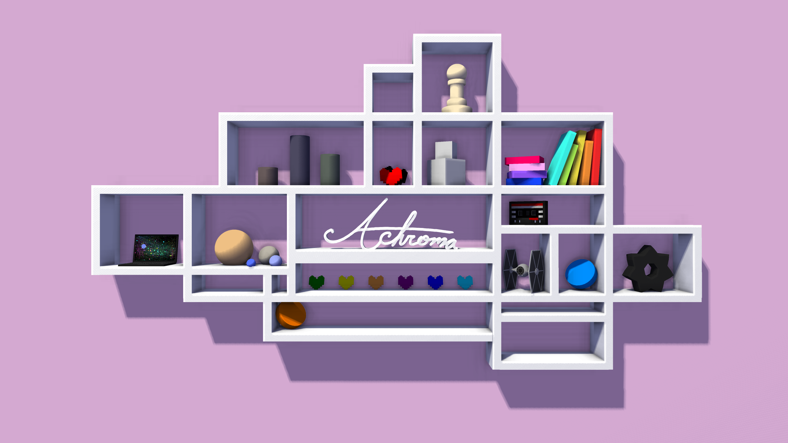
That "chest" board has a 6x6 checkerboard...? They have 8x8 boards - 2 rooks, 2 knights, 2 bishops, and the king and queen. I'm triggered because I've been on my school's chess team several times
-
I imagined the shelves being in an animator's studio, or something of the sorts. On the shelves were a bunch of props, items, or keepsakes they had.
-
My previous banner was really just a place-holder until I found something new to fit. I strayed away from anything Minecraft-y just so I had a banner I could use universally. This was the result, so enjoy, I guess.
-
Harkening back to Keep On Chucking's post, if one were to pay attention to what he put in it: They are "basically the same".
-
The wallpaper is actually really nice. Probably quite a bad thing I can relate so well with it tho.
-
Better tread lightly. Making puns shouldn't be forced - it's a reflection of the person.
-
You're "problem" is just an absurdly high level of bloom. Check the 'Threshold' slider under the bloom option in the camera menu. Level 0 is max bloom, 0.999 is minimal bloom, 1 is no bloom. The lower the decimal number, the less bloom. Level 0.95 works best for me, but it all depends on the scenario.
-
Forgot I had these images on my computer. Decided to re-render them with the MI Community Build 'cause I had nothing better to do. Figured they weren't much and didn't deserve their own individual posts.
-
God I love this gif
-
-
I love this. You kept the pixel sizes and textures - it really keeps the Minecraft-y feel. Also @Emaniplex, I wouldn't call myself a "seasoned expert".
-
So if/when we all die because of this election, y'all wanna be roommates in Hell?
-
This seems like an awesome build, yet I can't even seem to start it up. (I'm rather clueless on what it means. If it's just a simple solution then sorry for the waste of time) Nevermind. Just had to delete the original Mine-imator files instead of overwrite them for whatever reason. I really love the "Lock Bend Angle" feature. It's really useful cuz I'm lazy. I think I just found Voxy's new profile picture.
- 468 replies
-
- 1
-

-
- community build
- mine-imator
- (and 1 more)
-
The colour of the sky is kinda weird. A tad too saturated in my opinion. Sunlight looks to be coming from straight above (?). Try different angles for your light sources and add some depth of field for a more dynamic approach, emphasizing the focus of the wallpaper. Maybe spice up the background a little by adding some animals - something other than ferns and trees. also +1 because Life is Strange skins love you
-
(Has to draw something for a project)
(High as hell after oral surgery)
...this is gunna be fun
-
The two wallpapers have such contrasting themes and tonalities; it's hard to compare the two because both images showcase a different characteristic rather well.
-
The rigs, posing and camera work are all perfect, but maybe work on the lighting to add another layer of detail.
-
The use of down-sized blocks instead of custom textures kind of throws off the Minecraft-y feel with the differentiation of pixel sizes. As of the rig, I would suggest making it longer and sharper, as aforementioned numerous times by previous commenters.


![[GMK]animations](https://www.mineimatorforums.com/uploads/monthly_2016_12/banned.thumb.png.68961811a0e79a490e588eadc91de22e.thumb.png.e9272d1c9bfd81ff658b30fe528b7b96.thumb.png.a99d60b0f22395ced8668ff556bada35.png)


-
Recently Browsing 0 members
No registered users viewing this page.