Reputation
434
Covered in likes
See reputation activity
About Czai Knight
-
Rank
CKF

Contact Methods
Profile Information
-
Member Title
CKF
-
Gender
Male
-
Location
Earth
-
Minecraft username
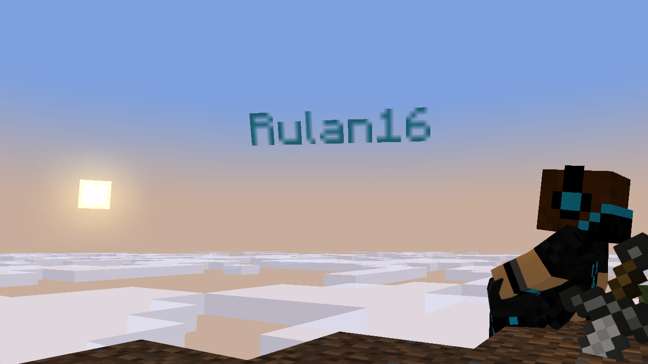
Rulan16
-
 Czai Knight reacted to a post in a topic:
Merry Early Christmas 2017 Render
-
 Czai Knight reacted to a post in a topic:
The little girl with her friend.
-
 Czai Knight reacted to a post in a topic:
Zombie City [4K Cinematic Wallpaper]
-
 Czai Knight reacted to a post in a topic:
Lip Sync Test
-
Actually, very good lip syncing, I like it! The body expression however is lacking but probably because their was not much to "express" in this scene. The eyes could blink a bit, he seems to just kind of stare too long. Lip sync was awesome! Pretty sure everything else like the body expression and the other facial parts are left unpolished and such due to the fact that you were focusing on lip syncing but to overall, I say a successful test it is!
-
 Czai Knight reacted to a post in a topic:
Makishima Jungle [4k]
-
 Czai Knight reacted to a post in a topic:
Judgement [Failed Mine-Imator Animation]
-
That edited one looks gorgeous!
- 6 replies
-
- arczisiontm
- @arczisiontm
- (and 4 more)
-
 Czai Knight reacted to a post in a topic:
Rain... | 4K cinematic wallpaper
-
 Czai Knight reacted to a post in a topic:
Trees [Wallpaper]
-
 Czai Knight reacted to a post in a topic:
Drone Attack - AWOL Wallpaper
-

Through the night (First time in awhile
Czai Knight replied to TheMineraftKid's topic in Wallpapers and art
The posing is completely fine but the lighting...I'm pretty sure there is only one source light...which isn't good... When I first looked at the picture, I didn't even REALIZE there was a torch! I suggest brightening up that torch's day and the same goes with the flaming particles. The color of the light seems a bit off, I don't think grass emits green light but if we are talking about sci-fi stuff like that then that's understandable. If not, I suggest switching the color of the light that is shining on that color to a more moonlight-ish color. Hoped this helped -
 HeYoNia reacted to a post in a topic:
Minecraft Black Hawk Down
-
 CraftyFoxe reacted to a post in a topic:
Minecraft Black Hawk Down
-

military Minecraft Black Hawk Down
Czai Knight replied to CraftyFoxe's topic in Narrative animations
Hmmmm this was pretty good but I'd have to give some feedback. I'm glad you used transitions so it looked alot better. When using schematics for vehicles, mod them a bit with rigs because the guy getting in the car at 0:49 was pretty bad. What I mean by modding (modifying) them is to remove that block on the door and replace it with a rigged door in the animation program. Lighting lacks a lot. Animation needs improvement. An example is at 0:48 lacked alot of keyframes and animation which made it look...well not as good. And try not to use a pose like that on 0:47, make the arms a little separate from the body and same goes with the legs, make the one leg separate from the other leg. The turning animation for the chopper is very abrupt and I suggest working on that. I suggest you use keyframe by keyframe animating solely on the chopper turning. 1:01, avoid showing flatlands at ALL times. Try to use fog or at least dont make the camera pan towards flatlands. 1:06, block mixing doesn't make anything look great. If your reason is that it might crash the project if you put in another schematic then thats understandable. But to fix this, all you have to do is spawn a grass block and use the "repeat" feature that you can do to blocks and use that instead. 1:19, I see you used the pre-set schematics Mine-imator gave you. I suggest to not use that and import your own schematics of forests. If you can't do that because it is time consuming and or you don't have the tools, that is fine. Hoped this helps you -
I actually had extreme doubts when I saw "First Rig" but yep, I've been proven wrong and i'm glad i was proven wrong. The rig itself is fantastic with its details and content. The showcase is what everyone could ask for to see what the rig is. The animation presented in the showcase was amazing and constructed well. Speaking one more time about the showcase, it tempted me to download this darn rig but I would've used it for nothing. 10/10 well done like cake.
-
 Menace reacted to a post in a topic:
tried to do night wallpaper
-
I love the lighting in this so much and the same goes with the detail and the sitting pose. One thing as the others are saying above is that the fire on the torch seems a bit off somehow. I cant put my finger on it but you should be able to figure it out. Overall, well done art.
-
 CisforCrispr reacted to a reply to a status update:
I finally got a heavy tank in WOT
-
 CisforCrispr reacted to a status update:
I finally got a heavy tank in WOT
-
I finally got a heavy tank in WOT
- Show previous comments 1 more
-

-

@CisforCrispr Indeed, the grinding is obnoxious. I try to counter it by picking some of my favorite tanks. The M4 Sherman (all time favorite) and my newest tank, the T1 Heavy.
-

-
The posing could use some work, maybe use the sheild to block some of the dragon's breath. I suggest also a new camera position, seems kind of stale right now. There is a huge lack of lighting and sources that emit light. Make sure you credit the rig. Scenery needs to be changed, its like skyblock but a very bad skyblock map. Overall, this seems a bit lower than decent but not terrible. Btw, dragons can fly and people can make up concepts and stories that dragons are in the overworld instead of the end.
-
 Creeperz Animations reacted to a post in a topic:
First Walk Cycle Test
-
 Benji reacted to a post in a topic:
First Walk Cycle Test
-
Thats pretty good! The arms seem to extend a little too far from the body. The head moves too much. The legs are good. I rate it 8/10, well done.
-
You still need pictures/images or a video, buddy.
-
 lifecraft reacted to a post in a topic:
minecraft short preview
-
 -(Retro)- reacted to a post in a topic:
Mike's Car Rig (1.0.6)
-
Lifecraft did use some transitions but just in some of the wrong places. Overall, the concept is okay since I have seen a couple of these already. Listen to Iron431 up there to add scenery because no one ever loves flatgrass. Use maybe a mine or cave for scenery considering this has to do with bedrock The facial expressions were decent. Be careful of that diamond pick phasing through the head, we don't need another Vision. Lacks lighting...probably because there is no lighting, I recommend you should fix that if your going to turn this into a full fledged animation. I really loved how you did 1:05 - 1:08. Gave me a good couple chuckles. Hoped this helped
-
The posing with the character is okay but the gun position makes it seem off. The art lacks lighting. Maybe add moonlight if you don't want to include other light sources in the art or possibly add a light on the helmet to the trooper. Scenery is a good choice. Hoped this helped
-
Oh my god...it's....perfect... I hope those tiny mirrors on the side of the car have reflective surfaces and have tiny text saying "Objects are closer than they appear".
- 48 replies
-
- extra thicc
- do not inhale
-
(and 1 more)
Tagged with:
-

Lightsaber! The power of Mineimator + After Effects!
Czai Knight replied to Gabe's topic in Wallpapers and art
You accidentally created a duplicated topic. Either hide this one or hide the other one. This is actually pretty neat! Love that lightsaber handle, posing, expression, and lighting! One thing I have to say though is that the lightsaber seems a bit off like its going too up other than following the direction where the handle is facing. Overall, pretty good for a first submitted wallpaper!
-
Recently Browsing 0 members
No registered users viewing this page.

.thumb.gif.6d6df435ea78ed3428e1b87043f2a837.gif)


.thumb.jpg.d7e51c1a5ffa7e2653620f789e5489cc.jpg)
