

Reputation Activity
-

 Voxy got a reaction from AshFox for a status update, Alright, I think it's best to just put all my thoughts in one place to make things cl
Alright, I think it's best to just put all my thoughts in one place to make things clearer.
I didn't really expect that revealing the new icon in a joke post would cause such a reaction. I initially dismissed it because, to be honest, the icon is a low priority for me, as there's a lot of stuff that still needs to be worked on to get the upcoming update ready, which is also why I wasn't very open to feedback, as I would much prefer to focus on getting feedback about the UI. I realize that was the wrong approach to the issue, hence why I'm writing this.
Another reason is that the branding is a little different to how I planned it going forward. While currently, the icon and logo are sort of stuck together, I decided to separate it all out into three distinct bits: logo, icon, and mascots. I don't plan on changing that, they will remain separate.
What is going to change is the icon itself. A recurring bit of criticism about the logo is that it doesn't feel related to Minecraft anymore. When I designed it, I just focused on making it readable. I tried to make it belong with the rest of the branding using evocative colors and shapes, but in the end, it appears that it lost too much character and ended up less appealing. As we speak, I'm currently working on a first iteration for a new design, which will hopefully tie-in with the program and the game it's based on:
This new design is rather popular with the Mine-imator staff, and I hope it will be for the rest of you too. If there are any ideas or improvements you'd like to share, feel free to.
Lastly, I'd like to apologize for my unprofessional and rude attitude. The rocky launch of Modelbench made it clear that transparency was important when it came to wanting to change how people use your program, but I hadn't realized that the icon would've been part of that too. I'll be sure to learn from that mistake and I hope we can move forward and work together in this next big step in the history of Mine-imator.
Take care, y'all. ✌️
-
 Voxy got a reaction from WaltsP7 for a status update, Hey all! Yesterday, I wrote an announcement regarding the surprise reveal of what was
Hey all!
Yesterday, I wrote an announcement regarding the surprise reveal of what was then going to be the new icon for Mine-imator going forward, and how the negative reception of it made me reconsider this design choice.
I took this opportunity to show you a different take on the icon, and judging by the overwhelmingly positive reactions, I think it's fair to say that we've got a winner on our hands! After a few minor tweaks and touch ups, I believe it's ready, waiting to be used once Mine-imator 1.3 launches.
But wait, what about Modelbench? Well, obviously I couldn't leave its icon untouched! After all, the goal of the rebrand is to unify both apps into one identity, so it's only natural to give it a fancy new icon as well! There was one challenge to overcome. What could we put in that colorful hexagon? Putting a bunch of cubes seemed like an obvious answer, but it just didn't look quite right... The Mine-imator icon had a 3D, Minecraft styled item inside that hexagon, so... Modelbench would have to follow that template, or else it just wouldn't work. But what kind of item should it be? What object is best suited to illustrate the modeling process?
What about a hammer? This was an idea from Nimi, that he had while we brainstormed. It could work, you can build stuff with one of those. The question was now, "what should it look like?". His proposal was a blacksmith's hammer, but I felt like it didn't fit the program's name too well. After all, it's called Modelbench, not Modelforge... (that would've been a neat name, though!) So, in the end, we settled on the good old claw hammer. And after a bit of quick rigging and tracing...
Here they are! The Mine-imator family now has its own set of icons! I hope you'll like it just as much as the one I've shown yesterday, and once again, please share any feedback you might have!
See you around!
-
 Voxy got a reaction from RobotCoveredWithHumanFlesh for a status update, Hey all! Yesterday, I wrote an announcement regarding the surprise reveal of what was
Hey all!
Yesterday, I wrote an announcement regarding the surprise reveal of what was then going to be the new icon for Mine-imator going forward, and how the negative reception of it made me reconsider this design choice.
I took this opportunity to show you a different take on the icon, and judging by the overwhelmingly positive reactions, I think it's fair to say that we've got a winner on our hands! After a few minor tweaks and touch ups, I believe it's ready, waiting to be used once Mine-imator 1.3 launches.
But wait, what about Modelbench? Well, obviously I couldn't leave its icon untouched! After all, the goal of the rebrand is to unify both apps into one identity, so it's only natural to give it a fancy new icon as well! There was one challenge to overcome. What could we put in that colorful hexagon? Putting a bunch of cubes seemed like an obvious answer, but it just didn't look quite right... The Mine-imator icon had a 3D, Minecraft styled item inside that hexagon, so... Modelbench would have to follow that template, or else it just wouldn't work. But what kind of item should it be? What object is best suited to illustrate the modeling process?
What about a hammer? This was an idea from Nimi, that he had while we brainstormed. It could work, you can build stuff with one of those. The question was now, "what should it look like?". His proposal was a blacksmith's hammer, but I felt like it didn't fit the program's name too well. After all, it's called Modelbench, not Modelforge... (that would've been a neat name, though!) So, in the end, we settled on the good old claw hammer. And after a bit of quick rigging and tracing...
Here they are! The Mine-imator family now has its own set of icons! I hope you'll like it just as much as the one I've shown yesterday, and once again, please share any feedback you might have!
See you around!
-
 Voxy got a reaction from JB Animations for a status update, Hey all! Yesterday, I wrote an announcement regarding the surprise reveal of what was
Hey all!
Yesterday, I wrote an announcement regarding the surprise reveal of what was then going to be the new icon for Mine-imator going forward, and how the negative reception of it made me reconsider this design choice.
I took this opportunity to show you a different take on the icon, and judging by the overwhelmingly positive reactions, I think it's fair to say that we've got a winner on our hands! After a few minor tweaks and touch ups, I believe it's ready, waiting to be used once Mine-imator 1.3 launches.
But wait, what about Modelbench? Well, obviously I couldn't leave its icon untouched! After all, the goal of the rebrand is to unify both apps into one identity, so it's only natural to give it a fancy new icon as well! There was one challenge to overcome. What could we put in that colorful hexagon? Putting a bunch of cubes seemed like an obvious answer, but it just didn't look quite right... The Mine-imator icon had a 3D, Minecraft styled item inside that hexagon, so... Modelbench would have to follow that template, or else it just wouldn't work. But what kind of item should it be? What object is best suited to illustrate the modeling process?
What about a hammer? This was an idea from Nimi, that he had while we brainstormed. It could work, you can build stuff with one of those. The question was now, "what should it look like?". His proposal was a blacksmith's hammer, but I felt like it didn't fit the program's name too well. After all, it's called Modelbench, not Modelforge... (that would've been a neat name, though!) So, in the end, we settled on the good old claw hammer. And after a bit of quick rigging and tracing...
Here they are! The Mine-imator family now has its own set of icons! I hope you'll like it just as much as the one I've shown yesterday, and once again, please share any feedback you might have!
See you around!
-
 Voxy got a reaction from YoshiHunter for a status update, Hey all! Yesterday, I wrote an announcement regarding the surprise reveal of what was
Hey all!
Yesterday, I wrote an announcement regarding the surprise reveal of what was then going to be the new icon for Mine-imator going forward, and how the negative reception of it made me reconsider this design choice.
I took this opportunity to show you a different take on the icon, and judging by the overwhelmingly positive reactions, I think it's fair to say that we've got a winner on our hands! After a few minor tweaks and touch ups, I believe it's ready, waiting to be used once Mine-imator 1.3 launches.
But wait, what about Modelbench? Well, obviously I couldn't leave its icon untouched! After all, the goal of the rebrand is to unify both apps into one identity, so it's only natural to give it a fancy new icon as well! There was one challenge to overcome. What could we put in that colorful hexagon? Putting a bunch of cubes seemed like an obvious answer, but it just didn't look quite right... The Mine-imator icon had a 3D, Minecraft styled item inside that hexagon, so... Modelbench would have to follow that template, or else it just wouldn't work. But what kind of item should it be? What object is best suited to illustrate the modeling process?
What about a hammer? This was an idea from Nimi, that he had while we brainstormed. It could work, you can build stuff with one of those. The question was now, "what should it look like?". His proposal was a blacksmith's hammer, but I felt like it didn't fit the program's name too well. After all, it's called Modelbench, not Modelforge... (that would've been a neat name, though!) So, in the end, we settled on the good old claw hammer. And after a bit of quick rigging and tracing...
Here they are! The Mine-imator family now has its own set of icons! I hope you'll like it just as much as the one I've shown yesterday, and once again, please share any feedback you might have!
See you around!
-
 Voxy got a reaction from BloxTheRigger for a status update, Hey all! Yesterday, I wrote an announcement regarding the surprise reveal of what was
Hey all!
Yesterday, I wrote an announcement regarding the surprise reveal of what was then going to be the new icon for Mine-imator going forward, and how the negative reception of it made me reconsider this design choice.
I took this opportunity to show you a different take on the icon, and judging by the overwhelmingly positive reactions, I think it's fair to say that we've got a winner on our hands! After a few minor tweaks and touch ups, I believe it's ready, waiting to be used once Mine-imator 1.3 launches.
But wait, what about Modelbench? Well, obviously I couldn't leave its icon untouched! After all, the goal of the rebrand is to unify both apps into one identity, so it's only natural to give it a fancy new icon as well! There was one challenge to overcome. What could we put in that colorful hexagon? Putting a bunch of cubes seemed like an obvious answer, but it just didn't look quite right... The Mine-imator icon had a 3D, Minecraft styled item inside that hexagon, so... Modelbench would have to follow that template, or else it just wouldn't work. But what kind of item should it be? What object is best suited to illustrate the modeling process?
What about a hammer? This was an idea from Nimi, that he had while we brainstormed. It could work, you can build stuff with one of those. The question was now, "what should it look like?". His proposal was a blacksmith's hammer, but I felt like it didn't fit the program's name too well. After all, it's called Modelbench, not Modelforge... (that would've been a neat name, though!) So, in the end, we settled on the good old claw hammer. And after a bit of quick rigging and tracing...
Here they are! The Mine-imator family now has its own set of icons! I hope you'll like it just as much as the one I've shown yesterday, and once again, please share any feedback you might have!
See you around!
-

.thumb.png.300cd721c8a910e1939549dfb1ac42d4.png) Voxy got a reaction from Skjold for a status update, Hey all! Yesterday, I wrote an announcement regarding the surprise reveal of what was
Voxy got a reaction from Skjold for a status update, Hey all! Yesterday, I wrote an announcement regarding the surprise reveal of what was
Hey all!
Yesterday, I wrote an announcement regarding the surprise reveal of what was then going to be the new icon for Mine-imator going forward, and how the negative reception of it made me reconsider this design choice.
I took this opportunity to show you a different take on the icon, and judging by the overwhelmingly positive reactions, I think it's fair to say that we've got a winner on our hands! After a few minor tweaks and touch ups, I believe it's ready, waiting to be used once Mine-imator 1.3 launches.
But wait, what about Modelbench? Well, obviously I couldn't leave its icon untouched! After all, the goal of the rebrand is to unify both apps into one identity, so it's only natural to give it a fancy new icon as well! There was one challenge to overcome. What could we put in that colorful hexagon? Putting a bunch of cubes seemed like an obvious answer, but it just didn't look quite right... The Mine-imator icon had a 3D, Minecraft styled item inside that hexagon, so... Modelbench would have to follow that template, or else it just wouldn't work. But what kind of item should it be? What object is best suited to illustrate the modeling process?
What about a hammer? This was an idea from Nimi, that he had while we brainstormed. It could work, you can build stuff with one of those. The question was now, "what should it look like?". His proposal was a blacksmith's hammer, but I felt like it didn't fit the program's name too well. After all, it's called Modelbench, not Modelforge... (that would've been a neat name, though!) So, in the end, we settled on the good old claw hammer. And after a bit of quick rigging and tracing...
Here they are! The Mine-imator family now has its own set of icons! I hope you'll like it just as much as the one I've shown yesterday, and once again, please share any feedback you might have!
See you around!
-
 Voxy got a reaction from MrPizzaCat for a status update, Hey all! Yesterday, I wrote an announcement regarding the surprise reveal of what was
Hey all!
Yesterday, I wrote an announcement regarding the surprise reveal of what was then going to be the new icon for Mine-imator going forward, and how the negative reception of it made me reconsider this design choice.
I took this opportunity to show you a different take on the icon, and judging by the overwhelmingly positive reactions, I think it's fair to say that we've got a winner on our hands! After a few minor tweaks and touch ups, I believe it's ready, waiting to be used once Mine-imator 1.3 launches.
But wait, what about Modelbench? Well, obviously I couldn't leave its icon untouched! After all, the goal of the rebrand is to unify both apps into one identity, so it's only natural to give it a fancy new icon as well! There was one challenge to overcome. What could we put in that colorful hexagon? Putting a bunch of cubes seemed like an obvious answer, but it just didn't look quite right... The Mine-imator icon had a 3D, Minecraft styled item inside that hexagon, so... Modelbench would have to follow that template, or else it just wouldn't work. But what kind of item should it be? What object is best suited to illustrate the modeling process?
What about a hammer? This was an idea from Nimi, that he had while we brainstormed. It could work, you can build stuff with one of those. The question was now, "what should it look like?". His proposal was a blacksmith's hammer, but I felt like it didn't fit the program's name too well. After all, it's called Modelbench, not Modelforge... (that would've been a neat name, though!) So, in the end, we settled on the good old claw hammer. And after a bit of quick rigging and tracing...
Here they are! The Mine-imator family now has its own set of icons! I hope you'll like it just as much as the one I've shown yesterday, and once again, please share any feedback you might have!
See you around!
-
.thumb.png.27cd7ed4cc7ddd9abd226250d1279255.png) Voxy got a reaction from TwoToRule for a status update, Alright, I think it's best to just put all my thoughts in one place to make things cl
Voxy got a reaction from TwoToRule for a status update, Alright, I think it's best to just put all my thoughts in one place to make things cl
Alright, I think it's best to just put all my thoughts in one place to make things clearer.
I didn't really expect that revealing the new icon in a joke post would cause such a reaction. I initially dismissed it because, to be honest, the icon is a low priority for me, as there's a lot of stuff that still needs to be worked on to get the upcoming update ready, which is also why I wasn't very open to feedback, as I would much prefer to focus on getting feedback about the UI. I realize that was the wrong approach to the issue, hence why I'm writing this.
Another reason is that the branding is a little different to how I planned it going forward. While currently, the icon and logo are sort of stuck together, I decided to separate it all out into three distinct bits: logo, icon, and mascots. I don't plan on changing that, they will remain separate.
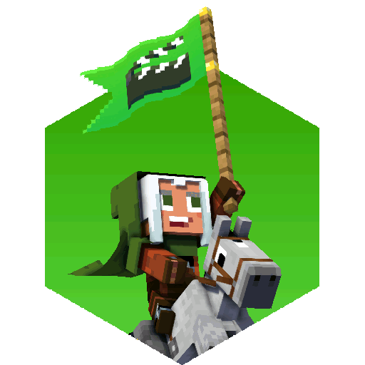
What is going to change is the icon itself. A recurring bit of criticism about the logo is that it doesn't feel related to Minecraft anymore. When I designed it, I just focused on making it readable. I tried to make it belong with the rest of the branding using evocative colors and shapes, but in the end, it appears that it lost too much character and ended up less appealing. As we speak, I'm currently working on a first iteration for a new design, which will hopefully tie-in with the program and the game it's based on:
This new design is rather popular with the Mine-imator staff, and I hope it will be for the rest of you too. If there are any ideas or improvements you'd like to share, feel free to.
Lastly, I'd like to apologize for my unprofessional and rude attitude. The rocky launch of Modelbench made it clear that transparency was important when it came to wanting to change how people use your program, but I hadn't realized that the icon would've been part of that too. I'll be sure to learn from that mistake and I hope we can move forward and work together in this next big step in the history of Mine-imator.
Take care, y'all. ✌️
-
 Voxy got a reaction from ShinyGHASTTear for a status update, Alright, I think it's best to just put all my thoughts in one place to make things cl
Alright, I think it's best to just put all my thoughts in one place to make things clearer.
I didn't really expect that revealing the new icon in a joke post would cause such a reaction. I initially dismissed it because, to be honest, the icon is a low priority for me, as there's a lot of stuff that still needs to be worked on to get the upcoming update ready, which is also why I wasn't very open to feedback, as I would much prefer to focus on getting feedback about the UI. I realize that was the wrong approach to the issue, hence why I'm writing this.
Another reason is that the branding is a little different to how I planned it going forward. While currently, the icon and logo are sort of stuck together, I decided to separate it all out into three distinct bits: logo, icon, and mascots. I don't plan on changing that, they will remain separate.
What is going to change is the icon itself. A recurring bit of criticism about the logo is that it doesn't feel related to Minecraft anymore. When I designed it, I just focused on making it readable. I tried to make it belong with the rest of the branding using evocative colors and shapes, but in the end, it appears that it lost too much character and ended up less appealing. As we speak, I'm currently working on a first iteration for a new design, which will hopefully tie-in with the program and the game it's based on:
This new design is rather popular with the Mine-imator staff, and I hope it will be for the rest of you too. If there are any ideas or improvements you'd like to share, feel free to.
Lastly, I'd like to apologize for my unprofessional and rude attitude. The rocky launch of Modelbench made it clear that transparency was important when it came to wanting to change how people use your program, but I hadn't realized that the icon would've been part of that too. I'll be sure to learn from that mistake and I hope we can move forward and work together in this next big step in the history of Mine-imator.
Take care, y'all. ✌️
-
 Voxy got a reaction from F animation for a status update, Alright, I think it's best to just put all my thoughts in one place to make things cl
Alright, I think it's best to just put all my thoughts in one place to make things clearer.
I didn't really expect that revealing the new icon in a joke post would cause such a reaction. I initially dismissed it because, to be honest, the icon is a low priority for me, as there's a lot of stuff that still needs to be worked on to get the upcoming update ready, which is also why I wasn't very open to feedback, as I would much prefer to focus on getting feedback about the UI. I realize that was the wrong approach to the issue, hence why I'm writing this.
Another reason is that the branding is a little different to how I planned it going forward. While currently, the icon and logo are sort of stuck together, I decided to separate it all out into three distinct bits: logo, icon, and mascots. I don't plan on changing that, they will remain separate.
What is going to change is the icon itself. A recurring bit of criticism about the logo is that it doesn't feel related to Minecraft anymore. When I designed it, I just focused on making it readable. I tried to make it belong with the rest of the branding using evocative colors and shapes, but in the end, it appears that it lost too much character and ended up less appealing. As we speak, I'm currently working on a first iteration for a new design, which will hopefully tie-in with the program and the game it's based on:
This new design is rather popular with the Mine-imator staff, and I hope it will be for the rest of you too. If there are any ideas or improvements you'd like to share, feel free to.
Lastly, I'd like to apologize for my unprofessional and rude attitude. The rocky launch of Modelbench made it clear that transparency was important when it came to wanting to change how people use your program, but I hadn't realized that the icon would've been part of that too. I'll be sure to learn from that mistake and I hope we can move forward and work together in this next big step in the history of Mine-imator.
Take care, y'all. ✌️
-

-

-
 Voxy got a reaction from Yugibear Creations for a status update, Alright, I think it's best to just put all my thoughts in one place to make things cl
Alright, I think it's best to just put all my thoughts in one place to make things clearer.
I didn't really expect that revealing the new icon in a joke post would cause such a reaction. I initially dismissed it because, to be honest, the icon is a low priority for me, as there's a lot of stuff that still needs to be worked on to get the upcoming update ready, which is also why I wasn't very open to feedback, as I would much prefer to focus on getting feedback about the UI. I realize that was the wrong approach to the issue, hence why I'm writing this.
Another reason is that the branding is a little different to how I planned it going forward. While currently, the icon and logo are sort of stuck together, I decided to separate it all out into three distinct bits: logo, icon, and mascots. I don't plan on changing that, they will remain separate.
What is going to change is the icon itself. A recurring bit of criticism about the logo is that it doesn't feel related to Minecraft anymore. When I designed it, I just focused on making it readable. I tried to make it belong with the rest of the branding using evocative colors and shapes, but in the end, it appears that it lost too much character and ended up less appealing. As we speak, I'm currently working on a first iteration for a new design, which will hopefully tie-in with the program and the game it's based on:
This new design is rather popular with the Mine-imator staff, and I hope it will be for the rest of you too. If there are any ideas or improvements you'd like to share, feel free to.
Lastly, I'd like to apologize for my unprofessional and rude attitude. The rocky launch of Modelbench made it clear that transparency was important when it came to wanting to change how people use your program, but I hadn't realized that the icon would've been part of that too. I'll be sure to learn from that mistake and I hope we can move forward and work together in this next big step in the history of Mine-imator.
Take care, y'all. ✌️
-
Voxy got a reaction from Korbs for a status update, Alright, I think it's best to just put all my thoughts in one place to make things cl
Alright, I think it's best to just put all my thoughts in one place to make things clearer.
I didn't really expect that revealing the new icon in a joke post would cause such a reaction. I initially dismissed it because, to be honest, the icon is a low priority for me, as there's a lot of stuff that still needs to be worked on to get the upcoming update ready, which is also why I wasn't very open to feedback, as I would much prefer to focus on getting feedback about the UI. I realize that was the wrong approach to the issue, hence why I'm writing this.
Another reason is that the branding is a little different to how I planned it going forward. While currently, the icon and logo are sort of stuck together, I decided to separate it all out into three distinct bits: logo, icon, and mascots. I don't plan on changing that, they will remain separate.
What is going to change is the icon itself. A recurring bit of criticism about the logo is that it doesn't feel related to Minecraft anymore. When I designed it, I just focused on making it readable. I tried to make it belong with the rest of the branding using evocative colors and shapes, but in the end, it appears that it lost too much character and ended up less appealing. As we speak, I'm currently working on a first iteration for a new design, which will hopefully tie-in with the program and the game it's based on:
This new design is rather popular with the Mine-imator staff, and I hope it will be for the rest of you too. If there are any ideas or improvements you'd like to share, feel free to.
Lastly, I'd like to apologize for my unprofessional and rude attitude. The rocky launch of Modelbench made it clear that transparency was important when it came to wanting to change how people use your program, but I hadn't realized that the icon would've been part of that too. I'll be sure to learn from that mistake and I hope we can move forward and work together in this next big step in the history of Mine-imator.
Take care, y'all. ✌️
-
 Voxy got a reaction from BaconSandwich for a status update, Alright, I think it's best to just put all my thoughts in one place to make things cl
Alright, I think it's best to just put all my thoughts in one place to make things clearer.
I didn't really expect that revealing the new icon in a joke post would cause such a reaction. I initially dismissed it because, to be honest, the icon is a low priority for me, as there's a lot of stuff that still needs to be worked on to get the upcoming update ready, which is also why I wasn't very open to feedback, as I would much prefer to focus on getting feedback about the UI. I realize that was the wrong approach to the issue, hence why I'm writing this.
Another reason is that the branding is a little different to how I planned it going forward. While currently, the icon and logo are sort of stuck together, I decided to separate it all out into three distinct bits: logo, icon, and mascots. I don't plan on changing that, they will remain separate.
What is going to change is the icon itself. A recurring bit of criticism about the logo is that it doesn't feel related to Minecraft anymore. When I designed it, I just focused on making it readable. I tried to make it belong with the rest of the branding using evocative colors and shapes, but in the end, it appears that it lost too much character and ended up less appealing. As we speak, I'm currently working on a first iteration for a new design, which will hopefully tie-in with the program and the game it's based on:
This new design is rather popular with the Mine-imator staff, and I hope it will be for the rest of you too. If there are any ideas or improvements you'd like to share, feel free to.
Lastly, I'd like to apologize for my unprofessional and rude attitude. The rocky launch of Modelbench made it clear that transparency was important when it came to wanting to change how people use your program, but I hadn't realized that the icon would've been part of that too. I'll be sure to learn from that mistake and I hope we can move forward and work together in this next big step in the history of Mine-imator.
Take care, y'all. ✌️
-
 Voxy got a reaction from Annie-Mienai for a status update, Alright, I think it's best to just put all my thoughts in one place to make things cl
Alright, I think it's best to just put all my thoughts in one place to make things clearer.
I didn't really expect that revealing the new icon in a joke post would cause such a reaction. I initially dismissed it because, to be honest, the icon is a low priority for me, as there's a lot of stuff that still needs to be worked on to get the upcoming update ready, which is also why I wasn't very open to feedback, as I would much prefer to focus on getting feedback about the UI. I realize that was the wrong approach to the issue, hence why I'm writing this.
Another reason is that the branding is a little different to how I planned it going forward. While currently, the icon and logo are sort of stuck together, I decided to separate it all out into three distinct bits: logo, icon, and mascots. I don't plan on changing that, they will remain separate.
What is going to change is the icon itself. A recurring bit of criticism about the logo is that it doesn't feel related to Minecraft anymore. When I designed it, I just focused on making it readable. I tried to make it belong with the rest of the branding using evocative colors and shapes, but in the end, it appears that it lost too much character and ended up less appealing. As we speak, I'm currently working on a first iteration for a new design, which will hopefully tie-in with the program and the game it's based on:
This new design is rather popular with the Mine-imator staff, and I hope it will be for the rest of you too. If there are any ideas or improvements you'd like to share, feel free to.
Lastly, I'd like to apologize for my unprofessional and rude attitude. The rocky launch of Modelbench made it clear that transparency was important when it came to wanting to change how people use your program, but I hadn't realized that the icon would've been part of that too. I'll be sure to learn from that mistake and I hope we can move forward and work together in this next big step in the history of Mine-imator.
Take care, y'all. ✌️
-
 Voxy got a reaction from Heavenira for a status update, Alright, I think it's best to just put all my thoughts in one place to make things cl
Alright, I think it's best to just put all my thoughts in one place to make things clearer.
I didn't really expect that revealing the new icon in a joke post would cause such a reaction. I initially dismissed it because, to be honest, the icon is a low priority for me, as there's a lot of stuff that still needs to be worked on to get the upcoming update ready, which is also why I wasn't very open to feedback, as I would much prefer to focus on getting feedback about the UI. I realize that was the wrong approach to the issue, hence why I'm writing this.
Another reason is that the branding is a little different to how I planned it going forward. While currently, the icon and logo are sort of stuck together, I decided to separate it all out into three distinct bits: logo, icon, and mascots. I don't plan on changing that, they will remain separate.
What is going to change is the icon itself. A recurring bit of criticism about the logo is that it doesn't feel related to Minecraft anymore. When I designed it, I just focused on making it readable. I tried to make it belong with the rest of the branding using evocative colors and shapes, but in the end, it appears that it lost too much character and ended up less appealing. As we speak, I'm currently working on a first iteration for a new design, which will hopefully tie-in with the program and the game it's based on:
This new design is rather popular with the Mine-imator staff, and I hope it will be for the rest of you too. If there are any ideas or improvements you'd like to share, feel free to.
Lastly, I'd like to apologize for my unprofessional and rude attitude. The rocky launch of Modelbench made it clear that transparency was important when it came to wanting to change how people use your program, but I hadn't realized that the icon would've been part of that too. I'll be sure to learn from that mistake and I hope we can move forward and work together in this next big step in the history of Mine-imator.
Take care, y'all. ✌️
-
 Voxy got a reaction from V.Isaac for a status update, Alright, I think it's best to just put all my thoughts in one place to make things cl
Alright, I think it's best to just put all my thoughts in one place to make things clearer.
I didn't really expect that revealing the new icon in a joke post would cause such a reaction. I initially dismissed it because, to be honest, the icon is a low priority for me, as there's a lot of stuff that still needs to be worked on to get the upcoming update ready, which is also why I wasn't very open to feedback, as I would much prefer to focus on getting feedback about the UI. I realize that was the wrong approach to the issue, hence why I'm writing this.
Another reason is that the branding is a little different to how I planned it going forward. While currently, the icon and logo are sort of stuck together, I decided to separate it all out into three distinct bits: logo, icon, and mascots. I don't plan on changing that, they will remain separate.
What is going to change is the icon itself. A recurring bit of criticism about the logo is that it doesn't feel related to Minecraft anymore. When I designed it, I just focused on making it readable. I tried to make it belong with the rest of the branding using evocative colors and shapes, but in the end, it appears that it lost too much character and ended up less appealing. As we speak, I'm currently working on a first iteration for a new design, which will hopefully tie-in with the program and the game it's based on:
This new design is rather popular with the Mine-imator staff, and I hope it will be for the rest of you too. If there are any ideas or improvements you'd like to share, feel free to.
Lastly, I'd like to apologize for my unprofessional and rude attitude. The rocky launch of Modelbench made it clear that transparency was important when it came to wanting to change how people use your program, but I hadn't realized that the icon would've been part of that too. I'll be sure to learn from that mistake and I hope we can move forward and work together in this next big step in the history of Mine-imator.
Take care, y'all. ✌️
-
 Voxy got a reaction from Keep on Chucking for a status update, Alright, I think it's best to just put all my thoughts in one place to make things cl
Alright, I think it's best to just put all my thoughts in one place to make things clearer.
I didn't really expect that revealing the new icon in a joke post would cause such a reaction. I initially dismissed it because, to be honest, the icon is a low priority for me, as there's a lot of stuff that still needs to be worked on to get the upcoming update ready, which is also why I wasn't very open to feedback, as I would much prefer to focus on getting feedback about the UI. I realize that was the wrong approach to the issue, hence why I'm writing this.
Another reason is that the branding is a little different to how I planned it going forward. While currently, the icon and logo are sort of stuck together, I decided to separate it all out into three distinct bits: logo, icon, and mascots. I don't plan on changing that, they will remain separate.
What is going to change is the icon itself. A recurring bit of criticism about the logo is that it doesn't feel related to Minecraft anymore. When I designed it, I just focused on making it readable. I tried to make it belong with the rest of the branding using evocative colors and shapes, but in the end, it appears that it lost too much character and ended up less appealing. As we speak, I'm currently working on a first iteration for a new design, which will hopefully tie-in with the program and the game it's based on:
This new design is rather popular with the Mine-imator staff, and I hope it will be for the rest of you too. If there are any ideas or improvements you'd like to share, feel free to.
Lastly, I'd like to apologize for my unprofessional and rude attitude. The rocky launch of Modelbench made it clear that transparency was important when it came to wanting to change how people use your program, but I hadn't realized that the icon would've been part of that too. I'll be sure to learn from that mistake and I hope we can move forward and work together in this next big step in the history of Mine-imator.
Take care, y'all. ✌️
-
 Voxy got a reaction from Swingzero for a status update, Alright, I think it's best to just put all my thoughts in one place to make things cl
Alright, I think it's best to just put all my thoughts in one place to make things clearer.
I didn't really expect that revealing the new icon in a joke post would cause such a reaction. I initially dismissed it because, to be honest, the icon is a low priority for me, as there's a lot of stuff that still needs to be worked on to get the upcoming update ready, which is also why I wasn't very open to feedback, as I would much prefer to focus on getting feedback about the UI. I realize that was the wrong approach to the issue, hence why I'm writing this.
Another reason is that the branding is a little different to how I planned it going forward. While currently, the icon and logo are sort of stuck together, I decided to separate it all out into three distinct bits: logo, icon, and mascots. I don't plan on changing that, they will remain separate.
What is going to change is the icon itself. A recurring bit of criticism about the logo is that it doesn't feel related to Minecraft anymore. When I designed it, I just focused on making it readable. I tried to make it belong with the rest of the branding using evocative colors and shapes, but in the end, it appears that it lost too much character and ended up less appealing. As we speak, I'm currently working on a first iteration for a new design, which will hopefully tie-in with the program and the game it's based on:
This new design is rather popular with the Mine-imator staff, and I hope it will be for the rest of you too. If there are any ideas or improvements you'd like to share, feel free to.
Lastly, I'd like to apologize for my unprofessional and rude attitude. The rocky launch of Modelbench made it clear that transparency was important when it came to wanting to change how people use your program, but I hadn't realized that the icon would've been part of that too. I'll be sure to learn from that mistake and I hope we can move forward and work together in this next big step in the history of Mine-imator.
Take care, y'all. ✌️
-
 Voxy got a reaction from Cryptic Runner for a status update, Alright, I think it's best to just put all my thoughts in one place to make things cl
Alright, I think it's best to just put all my thoughts in one place to make things clearer.
I didn't really expect that revealing the new icon in a joke post would cause such a reaction. I initially dismissed it because, to be honest, the icon is a low priority for me, as there's a lot of stuff that still needs to be worked on to get the upcoming update ready, which is also why I wasn't very open to feedback, as I would much prefer to focus on getting feedback about the UI. I realize that was the wrong approach to the issue, hence why I'm writing this.
Another reason is that the branding is a little different to how I planned it going forward. While currently, the icon and logo are sort of stuck together, I decided to separate it all out into three distinct bits: logo, icon, and mascots. I don't plan on changing that, they will remain separate.
What is going to change is the icon itself. A recurring bit of criticism about the logo is that it doesn't feel related to Minecraft anymore. When I designed it, I just focused on making it readable. I tried to make it belong with the rest of the branding using evocative colors and shapes, but in the end, it appears that it lost too much character and ended up less appealing. As we speak, I'm currently working on a first iteration for a new design, which will hopefully tie-in with the program and the game it's based on:
This new design is rather popular with the Mine-imator staff, and I hope it will be for the rest of you too. If there are any ideas or improvements you'd like to share, feel free to.
Lastly, I'd like to apologize for my unprofessional and rude attitude. The rocky launch of Modelbench made it clear that transparency was important when it came to wanting to change how people use your program, but I hadn't realized that the icon would've been part of that too. I'll be sure to learn from that mistake and I hope we can move forward and work together in this next big step in the history of Mine-imator.
Take care, y'all. ✌️
-
 Voxy got a reaction from Dannyboi for a status update, Alright, I think it's best to just put all my thoughts in one place to make things cl
Alright, I think it's best to just put all my thoughts in one place to make things clearer.
I didn't really expect that revealing the new icon in a joke post would cause such a reaction. I initially dismissed it because, to be honest, the icon is a low priority for me, as there's a lot of stuff that still needs to be worked on to get the upcoming update ready, which is also why I wasn't very open to feedback, as I would much prefer to focus on getting feedback about the UI. I realize that was the wrong approach to the issue, hence why I'm writing this.
Another reason is that the branding is a little different to how I planned it going forward. While currently, the icon and logo are sort of stuck together, I decided to separate it all out into three distinct bits: logo, icon, and mascots. I don't plan on changing that, they will remain separate.
What is going to change is the icon itself. A recurring bit of criticism about the logo is that it doesn't feel related to Minecraft anymore. When I designed it, I just focused on making it readable. I tried to make it belong with the rest of the branding using evocative colors and shapes, but in the end, it appears that it lost too much character and ended up less appealing. As we speak, I'm currently working on a first iteration for a new design, which will hopefully tie-in with the program and the game it's based on:
This new design is rather popular with the Mine-imator staff, and I hope it will be for the rest of you too. If there are any ideas or improvements you'd like to share, feel free to.
Lastly, I'd like to apologize for my unprofessional and rude attitude. The rocky launch of Modelbench made it clear that transparency was important when it came to wanting to change how people use your program, but I hadn't realized that the icon would've been part of that too. I'll be sure to learn from that mistake and I hope we can move forward and work together in this next big step in the history of Mine-imator.
Take care, y'all. ✌️
-
 Voxy got a reaction from Jnick for a status update, Alright, I think it's best to just put all my thoughts in one place to make things cl
Alright, I think it's best to just put all my thoughts in one place to make things clearer.
I didn't really expect that revealing the new icon in a joke post would cause such a reaction. I initially dismissed it because, to be honest, the icon is a low priority for me, as there's a lot of stuff that still needs to be worked on to get the upcoming update ready, which is also why I wasn't very open to feedback, as I would much prefer to focus on getting feedback about the UI. I realize that was the wrong approach to the issue, hence why I'm writing this.
Another reason is that the branding is a little different to how I planned it going forward. While currently, the icon and logo are sort of stuck together, I decided to separate it all out into three distinct bits: logo, icon, and mascots. I don't plan on changing that, they will remain separate.
What is going to change is the icon itself. A recurring bit of criticism about the logo is that it doesn't feel related to Minecraft anymore. When I designed it, I just focused on making it readable. I tried to make it belong with the rest of the branding using evocative colors and shapes, but in the end, it appears that it lost too much character and ended up less appealing. As we speak, I'm currently working on a first iteration for a new design, which will hopefully tie-in with the program and the game it's based on:
This new design is rather popular with the Mine-imator staff, and I hope it will be for the rest of you too. If there are any ideas or improvements you'd like to share, feel free to.
Lastly, I'd like to apologize for my unprofessional and rude attitude. The rocky launch of Modelbench made it clear that transparency was important when it came to wanting to change how people use your program, but I hadn't realized that the icon would've been part of that too. I'll be sure to learn from that mistake and I hope we can move forward and work together in this next big step in the history of Mine-imator.
Take care, y'all. ✌️
-
 Voxy got a reaction from Nimi for a status update, Alright, I think it's best to just put all my thoughts in one place to make things cl
Alright, I think it's best to just put all my thoughts in one place to make things clearer.
I didn't really expect that revealing the new icon in a joke post would cause such a reaction. I initially dismissed it because, to be honest, the icon is a low priority for me, as there's a lot of stuff that still needs to be worked on to get the upcoming update ready, which is also why I wasn't very open to feedback, as I would much prefer to focus on getting feedback about the UI. I realize that was the wrong approach to the issue, hence why I'm writing this.
Another reason is that the branding is a little different to how I planned it going forward. While currently, the icon and logo are sort of stuck together, I decided to separate it all out into three distinct bits: logo, icon, and mascots. I don't plan on changing that, they will remain separate.
What is going to change is the icon itself. A recurring bit of criticism about the logo is that it doesn't feel related to Minecraft anymore. When I designed it, I just focused on making it readable. I tried to make it belong with the rest of the branding using evocative colors and shapes, but in the end, it appears that it lost too much character and ended up less appealing. As we speak, I'm currently working on a first iteration for a new design, which will hopefully tie-in with the program and the game it's based on:
This new design is rather popular with the Mine-imator staff, and I hope it will be for the rest of you too. If there are any ideas or improvements you'd like to share, feel free to.
Lastly, I'd like to apologize for my unprofessional and rude attitude. The rocky launch of Modelbench made it clear that transparency was important when it came to wanting to change how people use your program, but I hadn't realized that the icon would've been part of that too. I'll be sure to learn from that mistake and I hope we can move forward and work together in this next big step in the history of Mine-imator.
Take care, y'all. ✌️
-
Recently Browsing 0 members
No registered users viewing this page.