


About Voxy
-
Rank
? eekum bokum
")
- Birthday 07/09/1998
Recent Profile Visitors


Single Status Update
-
Alright, I think it's best to just put all my thoughts in one place to make things clearer.
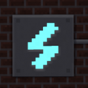
I didn't really expect that revealing the new icon in a joke post would cause such a reaction. I initially dismissed it because, to be honest, the icon is a low priority for me, as there's a lot of stuff that still needs to be worked on to get the upcoming update ready, which is also why I wasn't very open to feedback, as I would much prefer to focus on getting feedback about the UI. I realize that was the wrong approach to the issue, hence why I'm writing this.
Another reason is that the branding is a little different to how I planned it going forward. While currently, the icon and logo are sort of stuck together, I decided to separate it all out into three distinct bits: logo, icon, and mascots. I don't plan on changing that, they will remain separate.
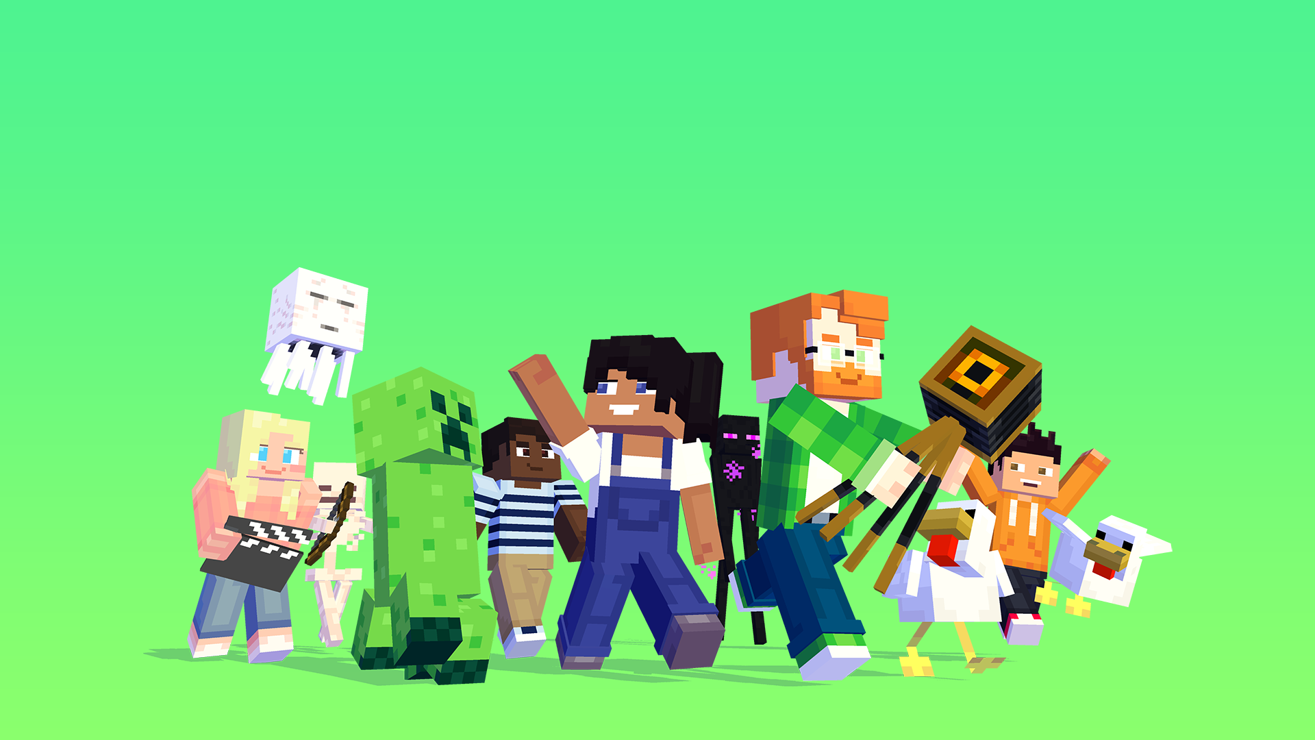
What is going to change is the icon itself. A recurring bit of criticism about the logo is that it doesn't feel related to Minecraft anymore. When I designed it, I just focused on making it readable. I tried to make it belong with the rest of the branding using evocative colors and shapes, but in the end, it appears that it lost too much character and ended up less appealing. As we speak, I'm currently working on a first iteration for a new design, which will hopefully tie-in with the program and the game it's based on:

This new design is rather popular with the Mine-imator staff, and I hope it will be for the rest of you too. If there are any ideas or improvements you'd like to share, feel free to.
Lastly, I'd like to apologize for my unprofessional and rude attitude. The rocky launch of Modelbench made it clear that transparency was important when it came to wanting to change how people use your program, but I hadn't realized that the icon would've been part of that too. I'll be sure to learn from that mistake and I hope we can move forward and work together in this next big step in the history of Mine-imator.
Take care, y'all.

- Show previous comments 16 more
-

@Annie-Mienai That's a bit more complicated. The world importer is written in a different language than MI and MB (it's written in C#, MI/MB use GML), which Nimi isn't very familiar with. So I can't make any promises, though I'd very much like to update it as well.
-
- Nimi and Annie-Mienai
-
 1
1
-
 1
1
-

@Voxy I understand, I was going to make a post about the WorldImport interface. But if you say that it is probably not possible then, I will only publish the image of the concept. https://imgur.com/JHTQtuL
anyway, thanks for clarifying my doubts about the new designs. -
@Annie-Mienai Wow, that's a very impressive mockup!
 A 3D view might be a bit ambitious though, haha!
-
- Annie-Mienai and Draco63
-
2
-
Recently Browsing 0 members
No registered users viewing this page.