

Everything posted by TheAnimatorDude
-
Holy cow, that looks amazing! I especially love the lighting!
-
 Everything looks good, except for the stone. They are too round to be realistic. Just try making them rougher!
 -
This looks AMAZING!! The only thing that bothers me, is that there is water coming out of leaves on the right side. But other than that PERFECT!!
-
I don't know if it's just me, but I can't see anything except the light rod. Try to make it a bit brighter and I am sure it will look cool!!
-
Damm that lighting! This is awesome man! Would have been cool if the crafting table was 3D, but other than that...PERFECT
-
My favorites are #1 and #9! AMAZING job man, they all look really good! I like your style. But while it is minimalism, a little more detail would be nice
-
Yes, I noticed, but I still cant figure out that he regrets something...
-
It really looks good! Buuut, if I hadn't read the title I would have no idea why he is so sad. An image should speak for itself. This does look really cool, just try to add more "story" to it
-
It looks better without the edit to be honest. Tip: Add a ground to the scene. Right now, I feel like they are floating in the air. But other than that, I LIKE It!
-
Holy moly, this was AMAZING. Allmost everything was perfect. Only the lighting and the walking weren't so good sometimes, but other than that PERFECT
-
better than michael bay Transformers
TheAnimatorDude replied to Pixel Nitro's topic in Narrative animations
That was GREAT, so FUNNY!! -
This chick needs a name. [Wall Paper]
TheAnimatorDude replied to Ninja Dino's topic in Wallpapers and art
Lisa -
Looks GREAT, NICE and SIMPLE
-
1000 subs animation (Very emotional)
TheAnimatorDude replied to Flaster's topic in Narrative animations
NO! If you believe you can you will. There is a saying: If you say you can't, you can't, but if you say, you can, you can. You will be right both ways. -
I love the lighting, well done!
-
overedited/ there is too much glow
-
looks kinda plain to be honest. Try to add more detail so the image has more to it
-
Awesome, although you should try to make the hologram more visible
-
I dont mean how much light there is...Even when it is dark there are shadows, especially if there is a torch. Watch a the tutoriol from Kiepoco Studios, it is very helpful!
-
the character's poses are fine but work on the lighting!
-
Race: human, not white. We are all human, no matter the color
-
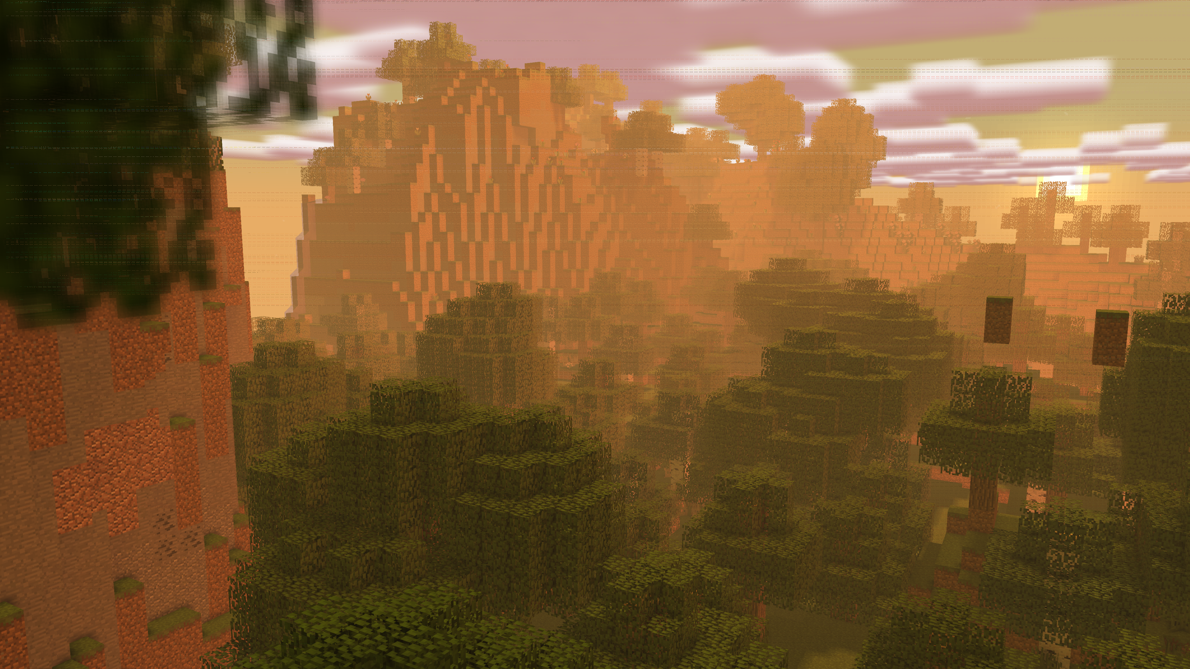
art 2K - The Evergreen Forest - 2K
TheAnimatorDude replied to Tiedemies1's topic in Wallpapers and art
I know, but that doesnt change the fact that they look weird. No offence, the wallpaper is really good. The lillypads are just one smal messed up detail -
art 2K - The Evergreen Forest - 2K
TheAnimatorDude replied to Tiedemies1's topic in Wallpapers and art
the lillypads look weird, but other than that, noice -
Wether I give someone a down/up vote is relative. Let me explain. SKIBBZ posts a lot of amazing stuff here. If I would compare him with most of the other publishers on the forums, I would leave him a like on this wallpaper. But doing this isn't constructive if the publisher (in this case SKIBBZ) stands way out of the crowd (meaning he is much better than the rest of us). --> I gave this post negative feedback because, compared to his other work, it isn't good in my opinion. It is way over-edited and too dark. (This is debateable, but that's simply my taste) In conclusion: This wallpaper is good indeed, but not compared to others SKIBBZ has made.


-
Recently Browsing 0 members
No registered users viewing this page.